Logo
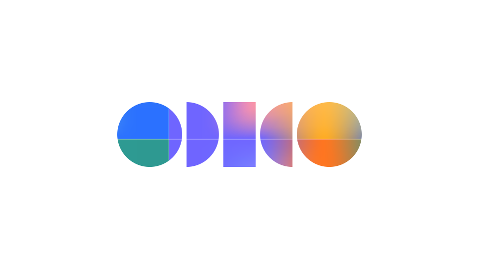
Our logo blends a logo mark and a word mark seamlessly. When you see “Odido” within it, it becomes unforgettable. It’s designed to be read both ways, making a lasting impression.
Versions
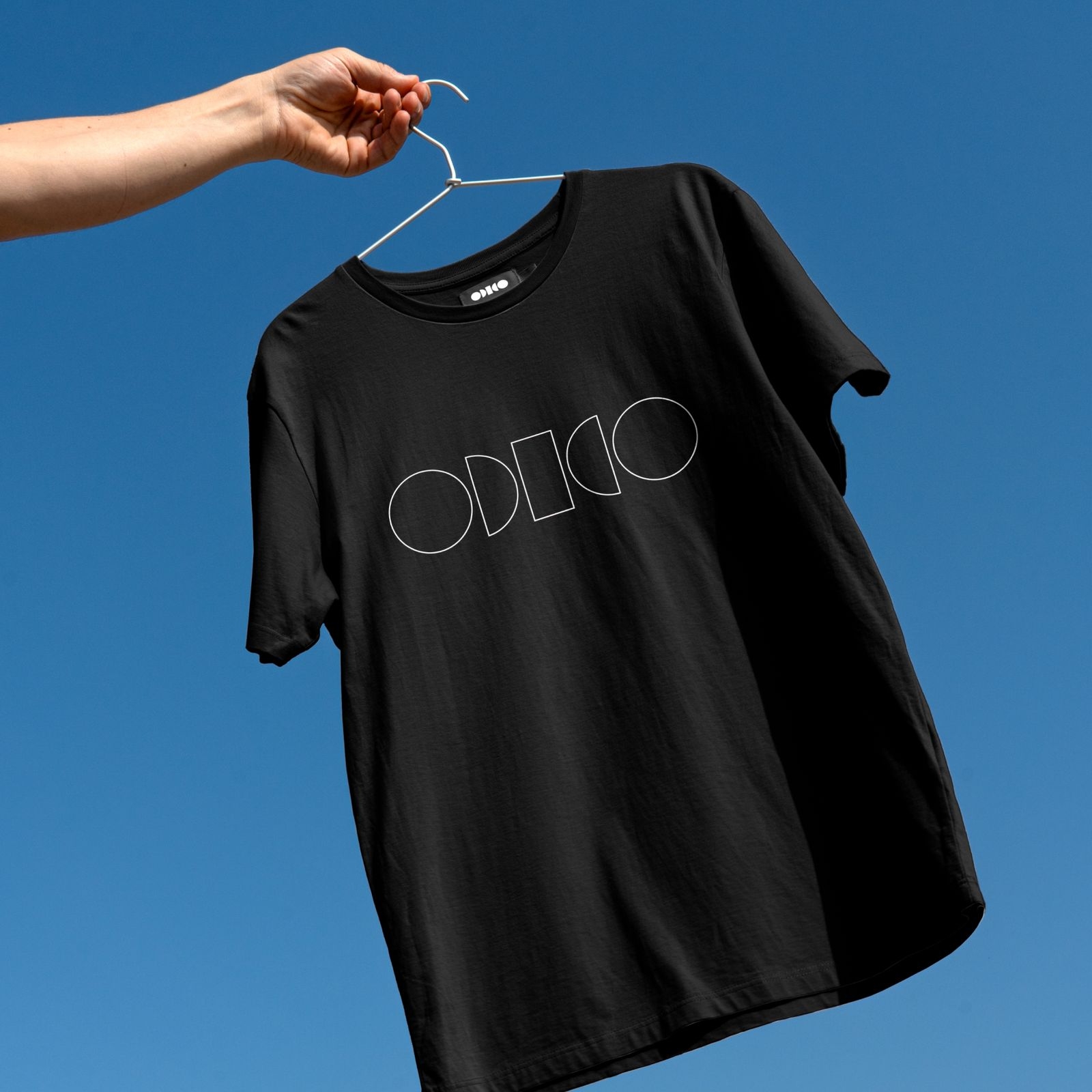
Explore all logo versions available here, including the colour logo for entry level and the solid logo for participation and functional levels, each with standard and small sizes. The outlined and masked logos are for special uses only, they are exclusively available in standard sizes, and their use in smaller sizes is not permitted.
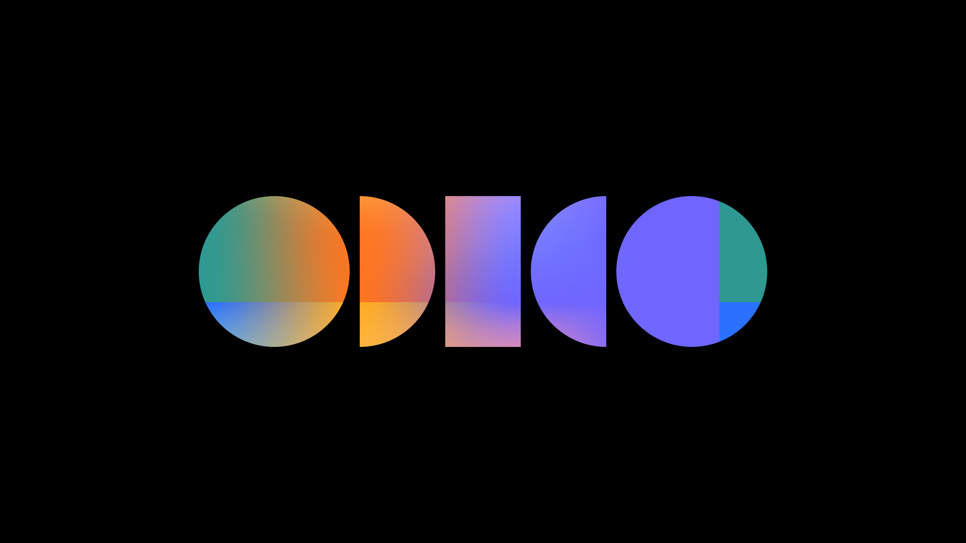

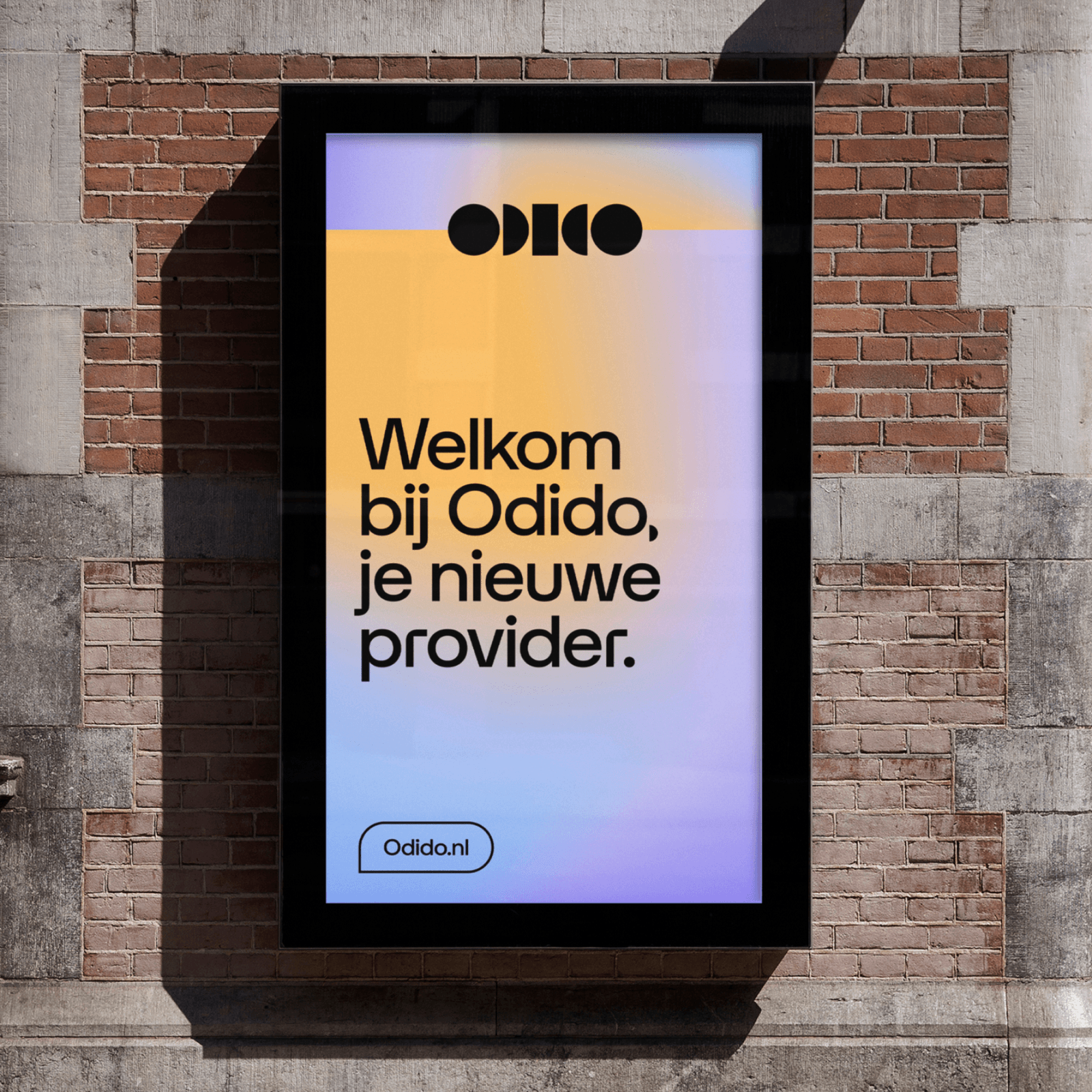
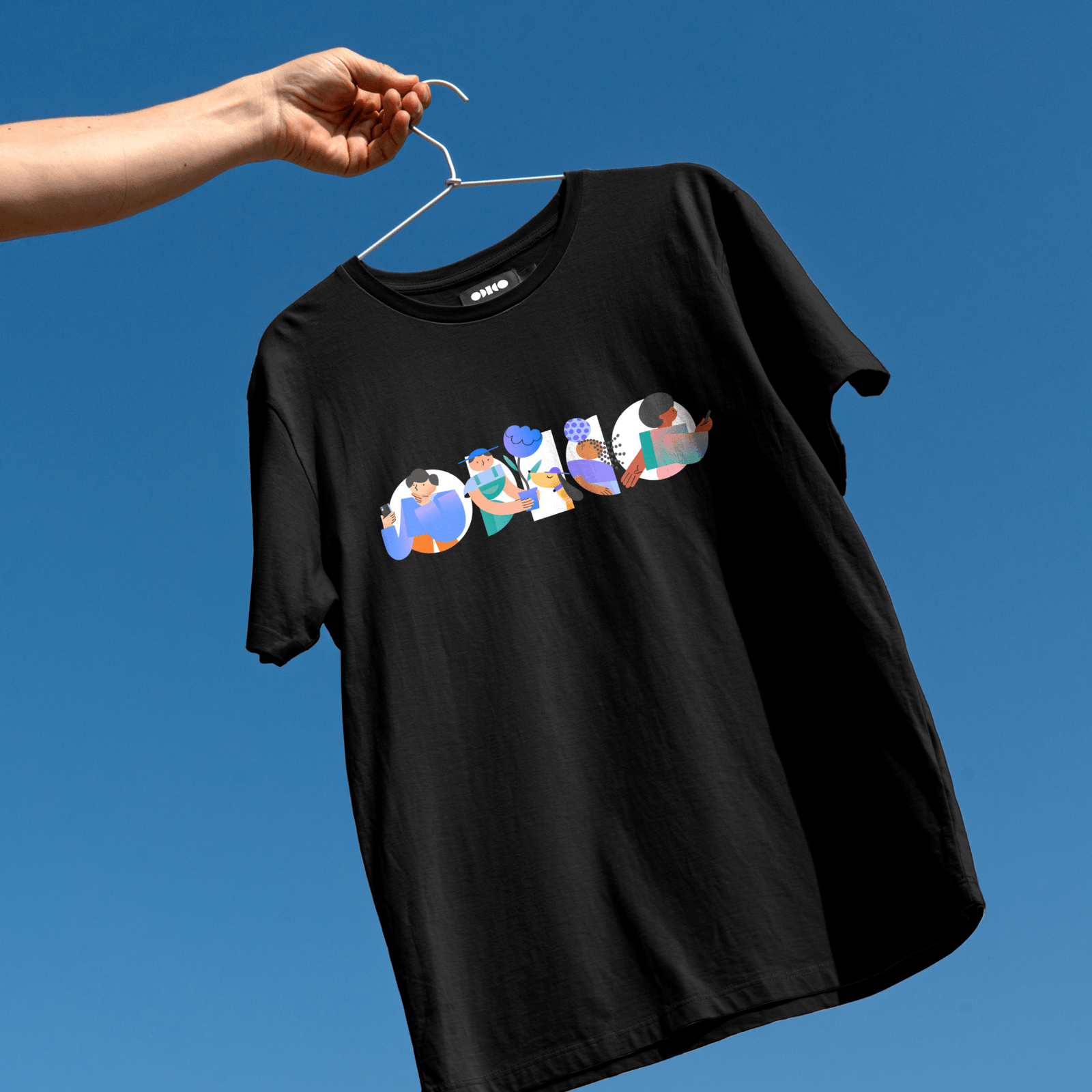
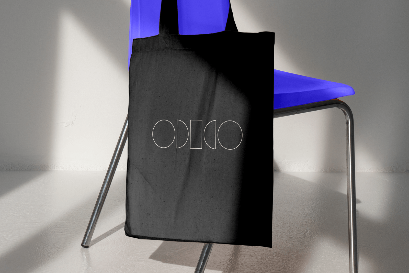
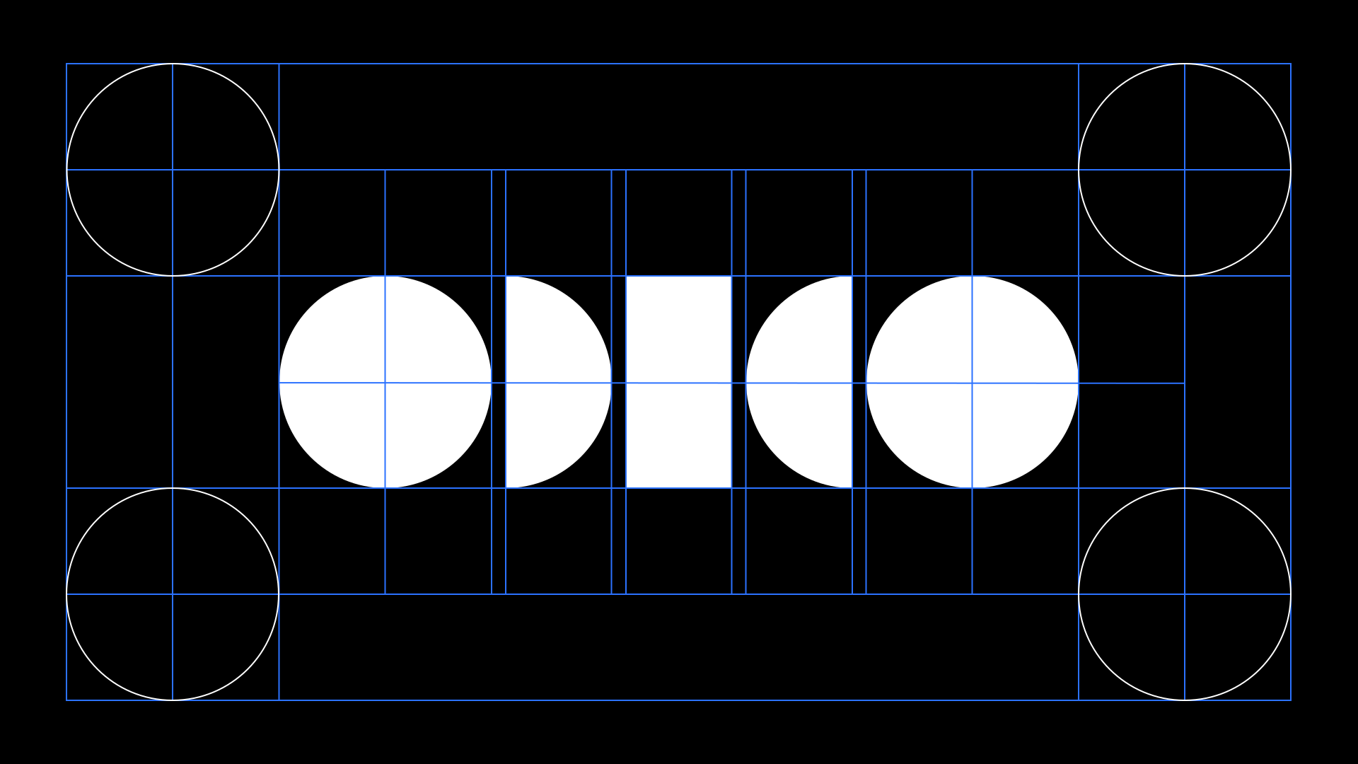
Our logo based on a balance grid is geometrical and timeless.
Minimum sizes
The standard logo is used up to 135px or 30mm wide. Below this size, the small use logo is mandatory to maintain clarity and avoid clutter. Minimum size of the small use logo is 60px or 16mm.

Clearspace
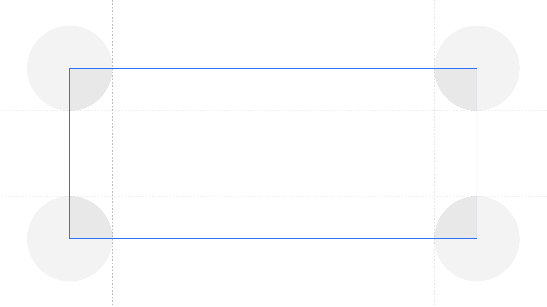
Our logos include built-in clear space to ensure proper placement, avoiding proximity to edges or other elements. This clear space represents the minimum distance required.
Placement
Placement with Glow Mirror
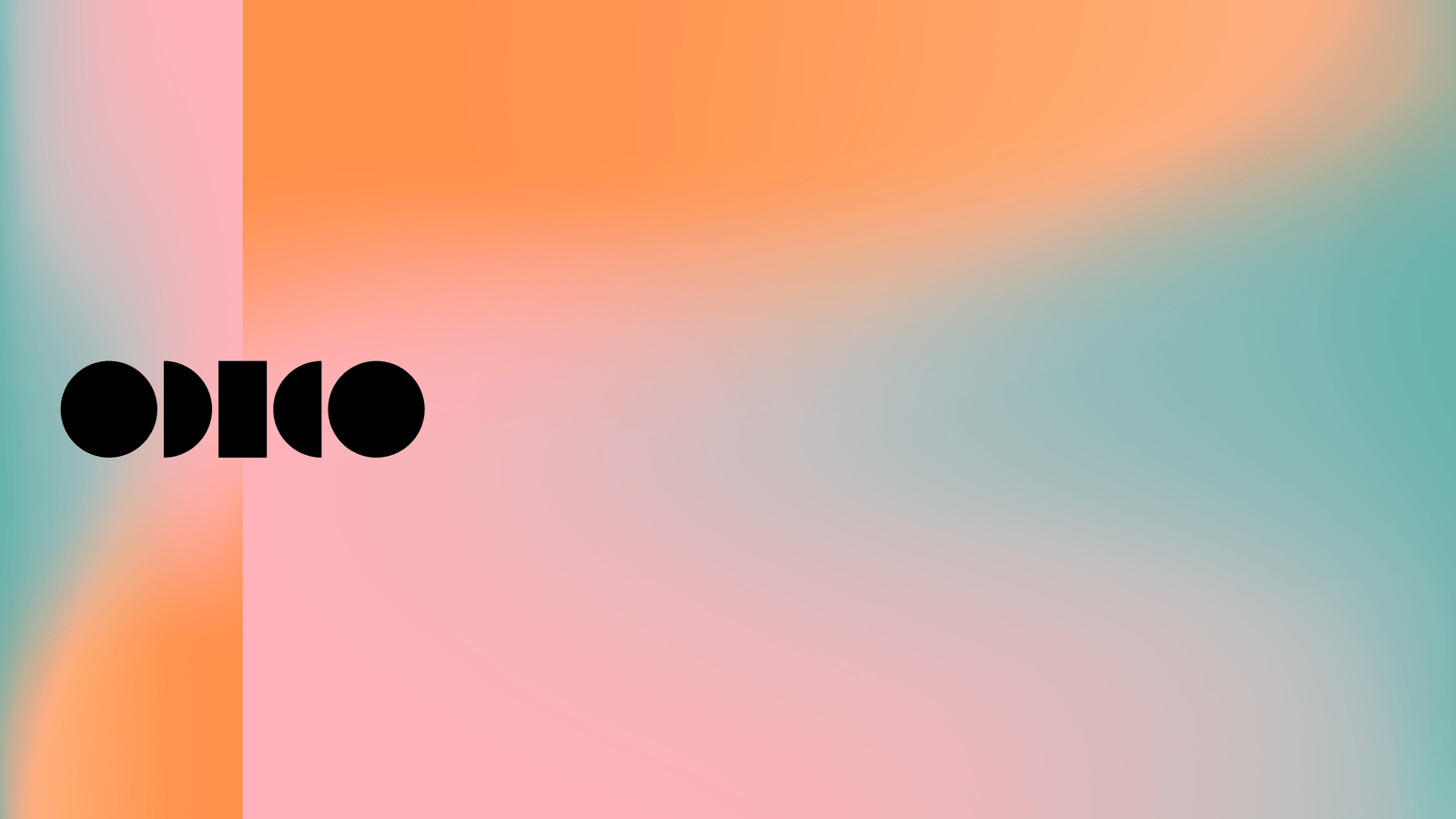
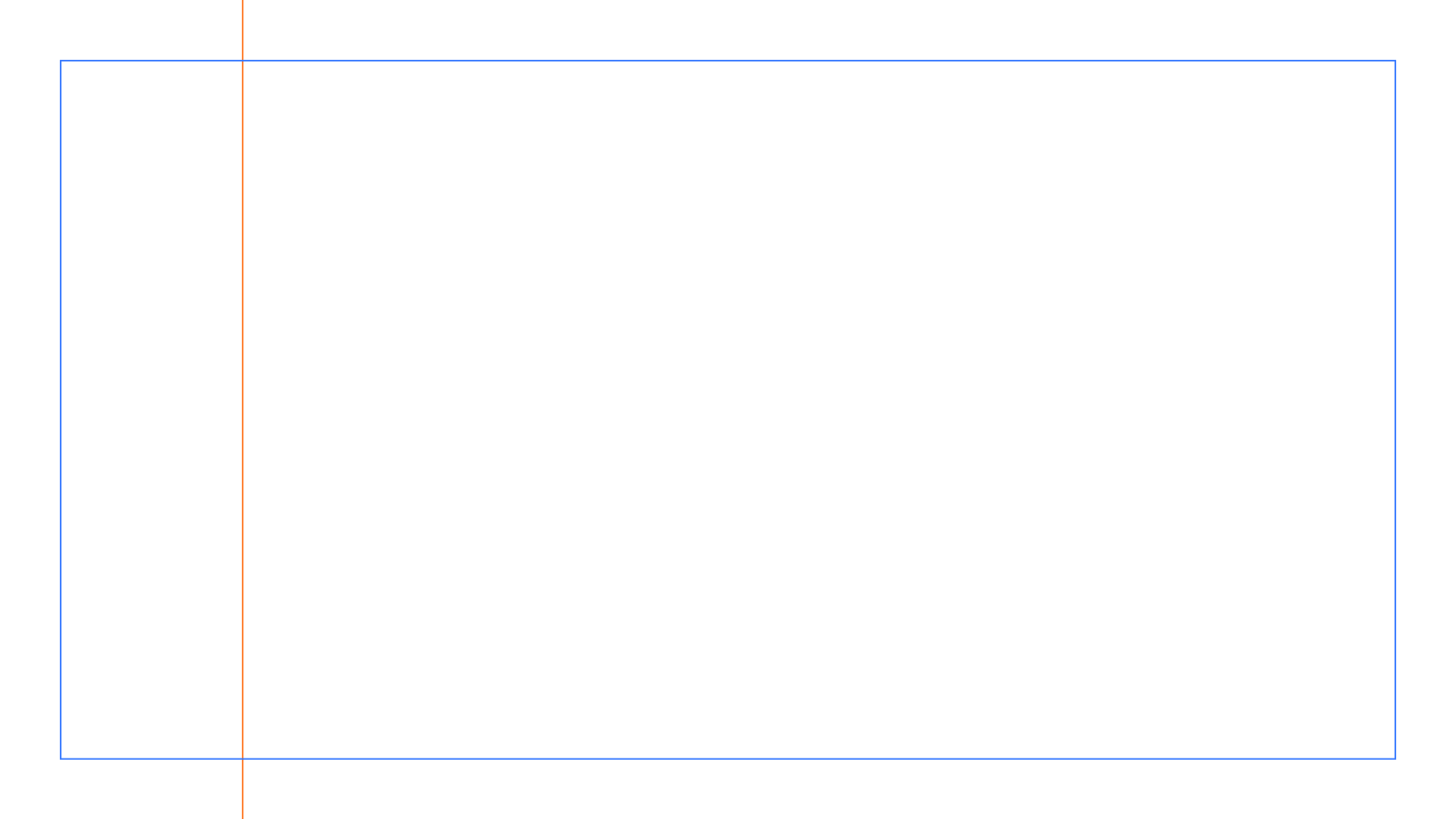
On participation level we always place the logo on top of the Mirror axis.
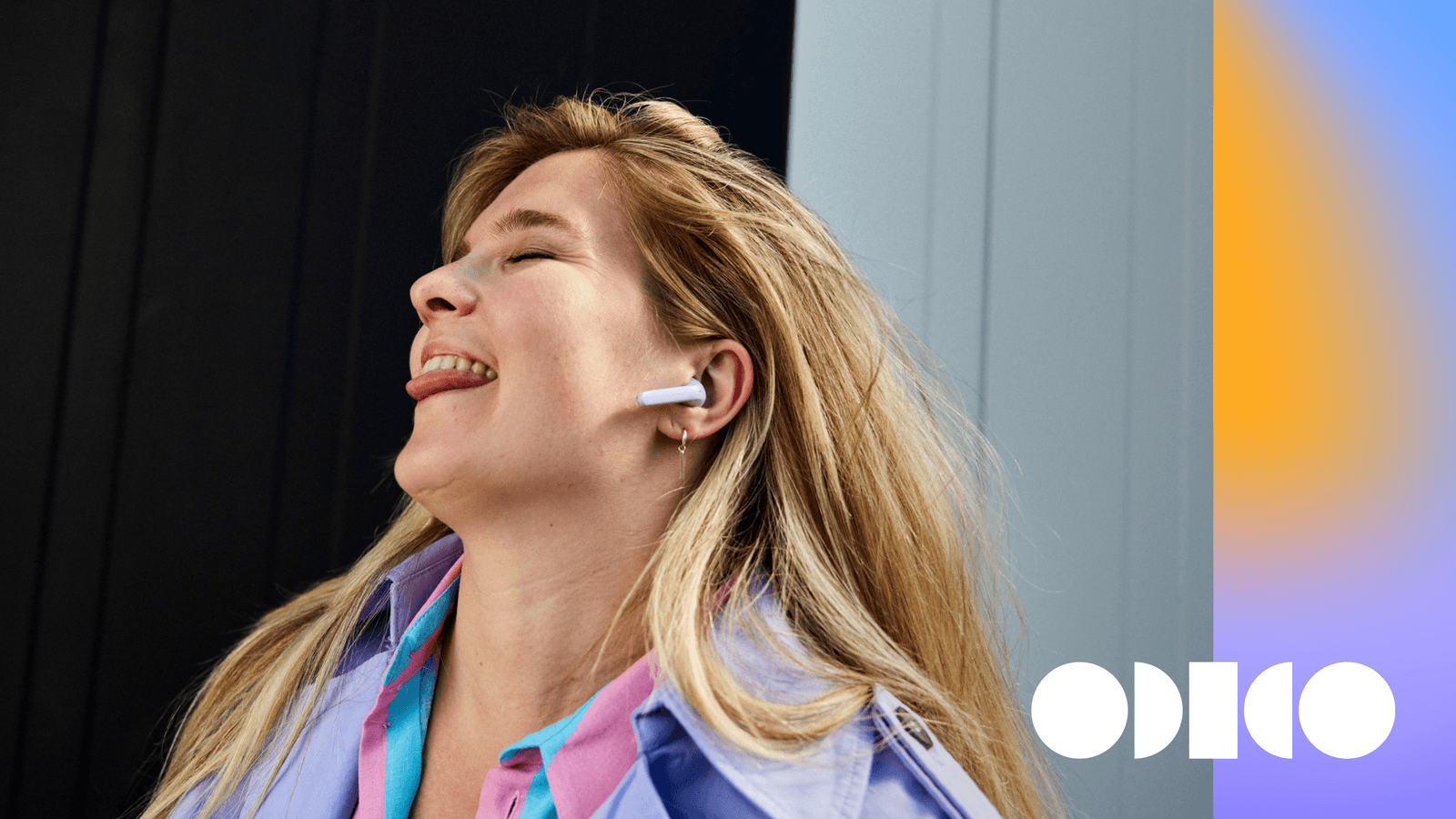
Placement with Glow and photography Mirror
Here’s a suggested placement for the logo while using the Glow Mirror and photography. Use white logo on dark photography and use black logo on light photography.

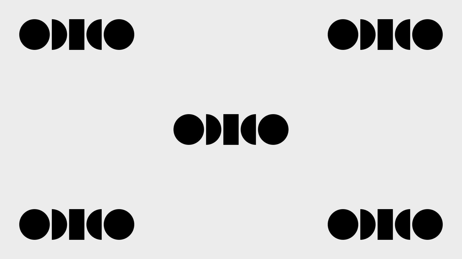
Placement without Mirror
Explore these suggested logo placements, all perfectly tailored for a single image setting. Remember to use only one logo at a time.

Colour options
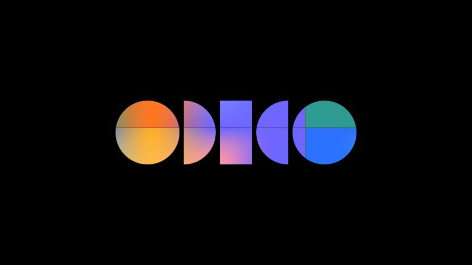
Colour logo
The colour logo takes the stage and invites you to the colourful world of Odido. The preferred use is on a black background.
Colour logo on black
Colour logo on white

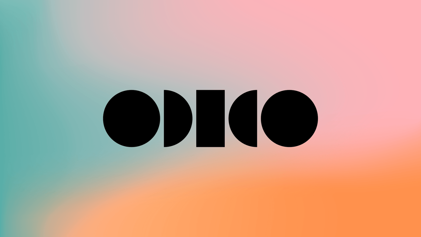
Solid logo with Glow
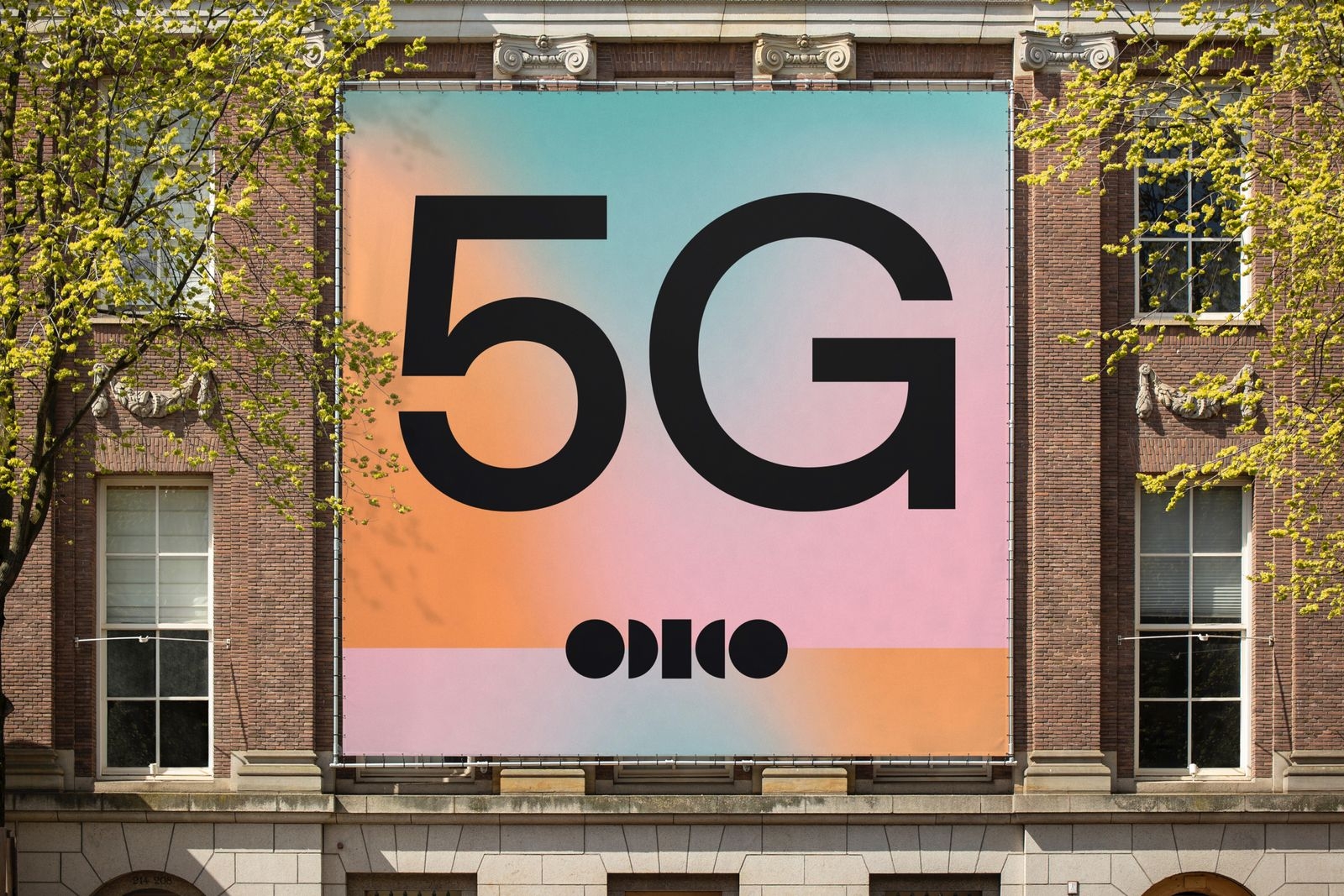
The preferred solid logo is black on default Glow. If the logo has to be white then use darker versions of Glow to ensure readability.
Black logo on default Glow
White logo on darker Glow
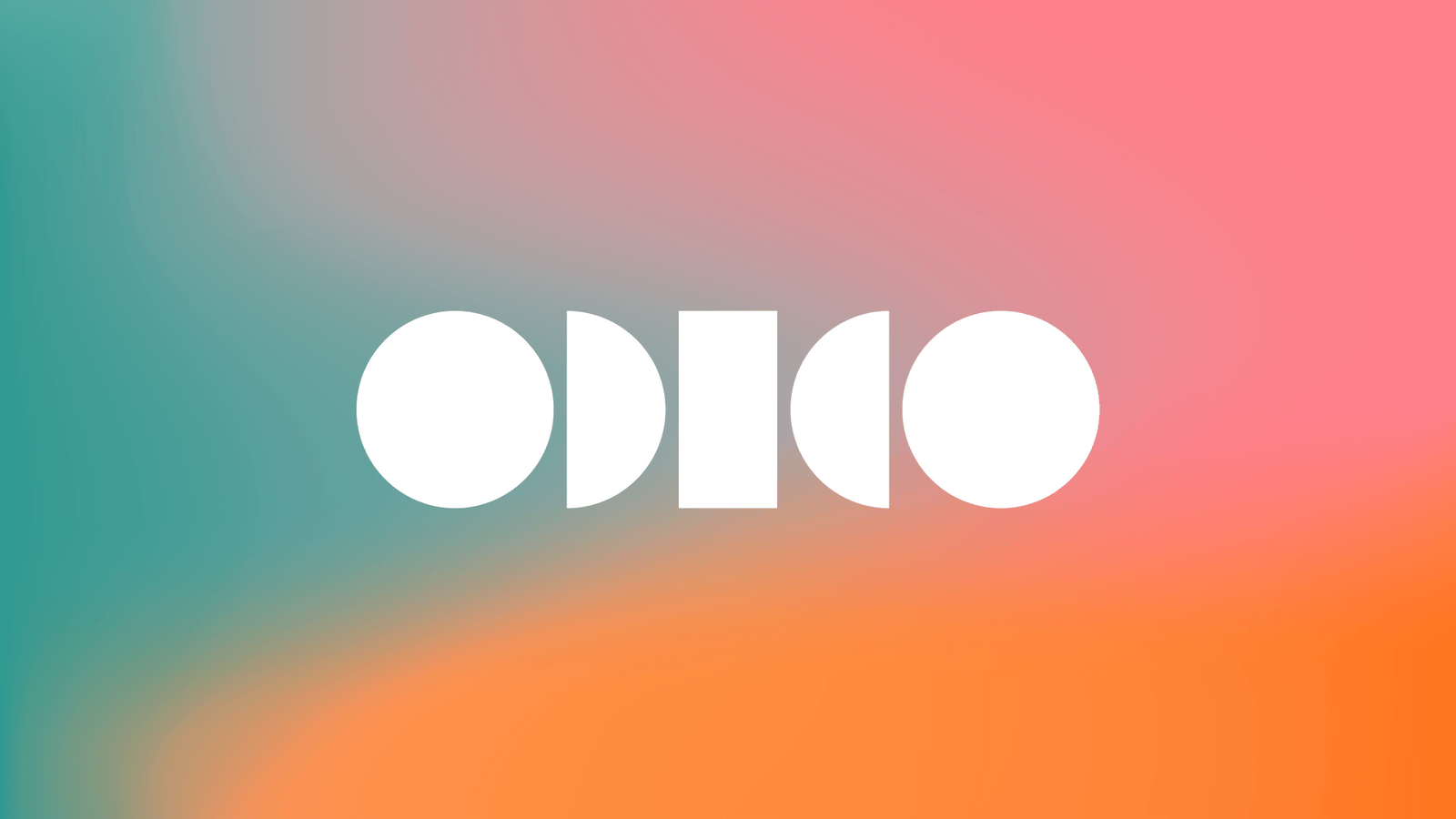
Solid logo with colour palette
Leverage this box to discover ways of enhancing the visibility of the primary logo on various backgrounds using our colour palette.
100% tint background
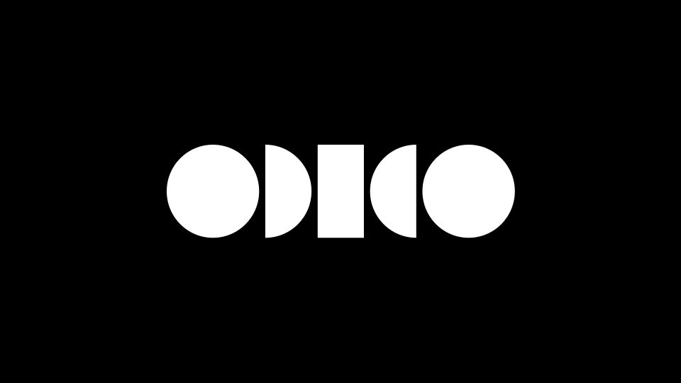
100% tint background

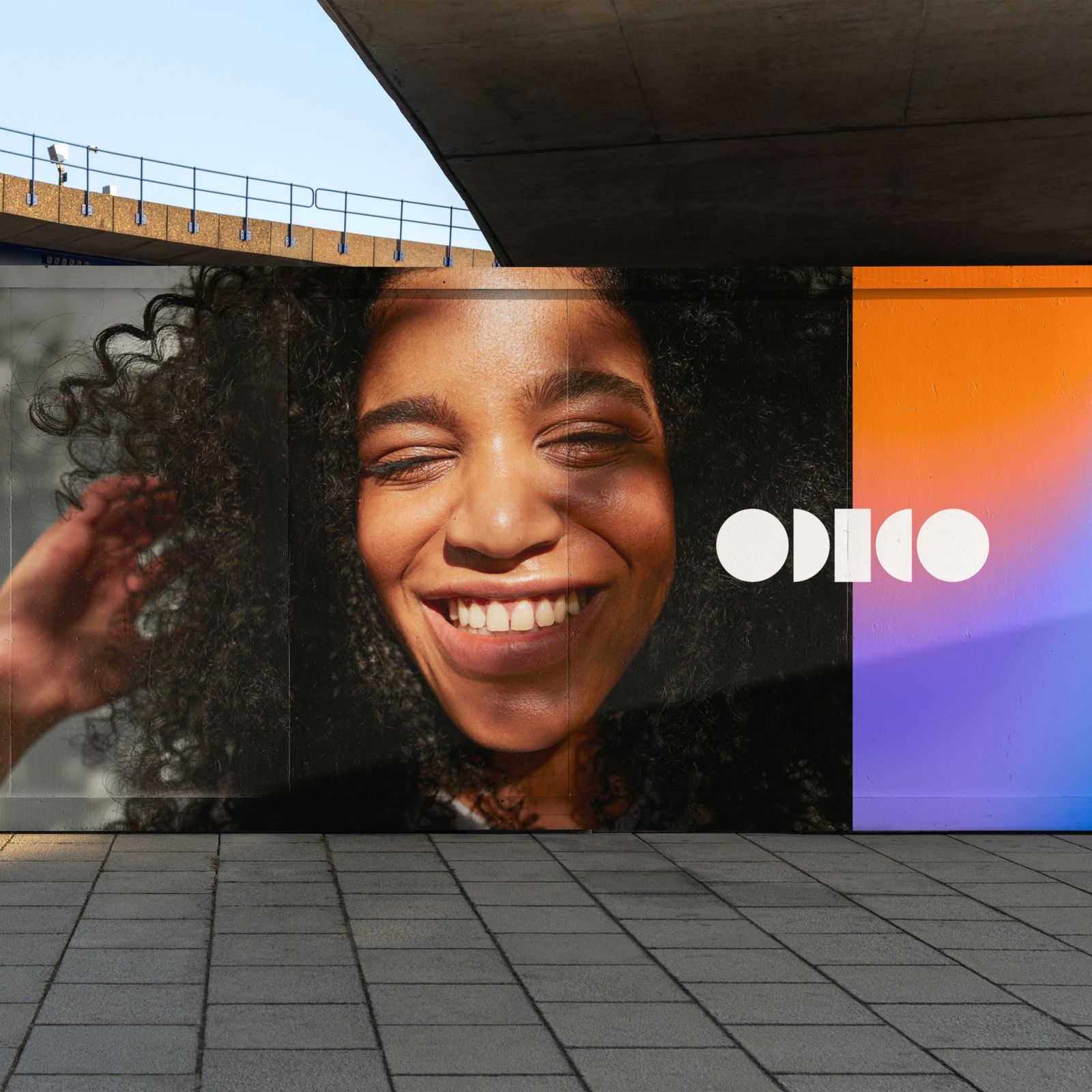
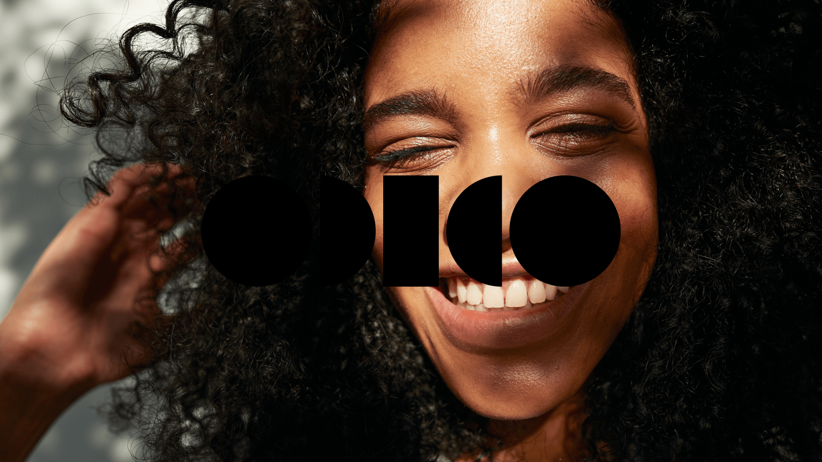
Logo on image
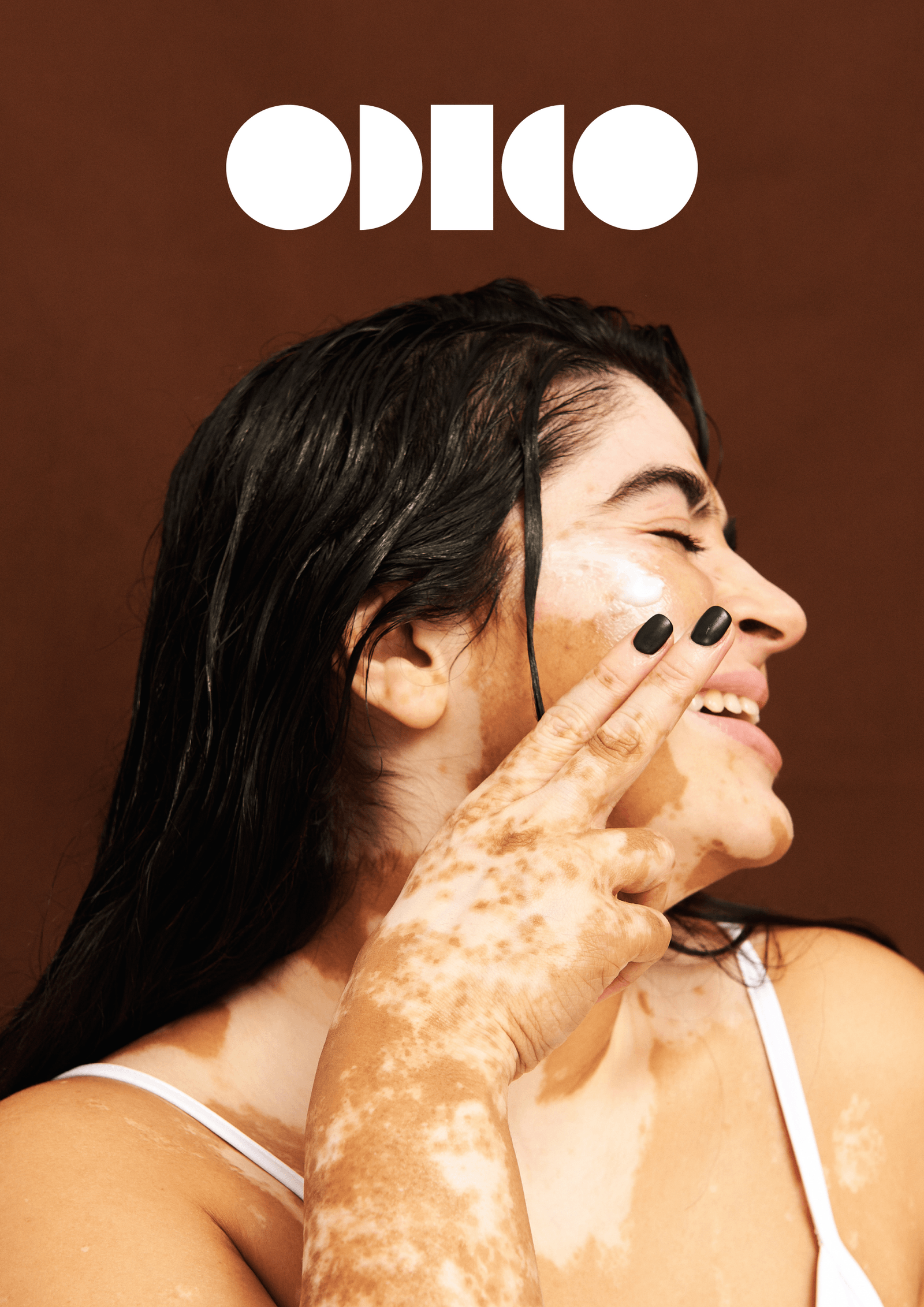
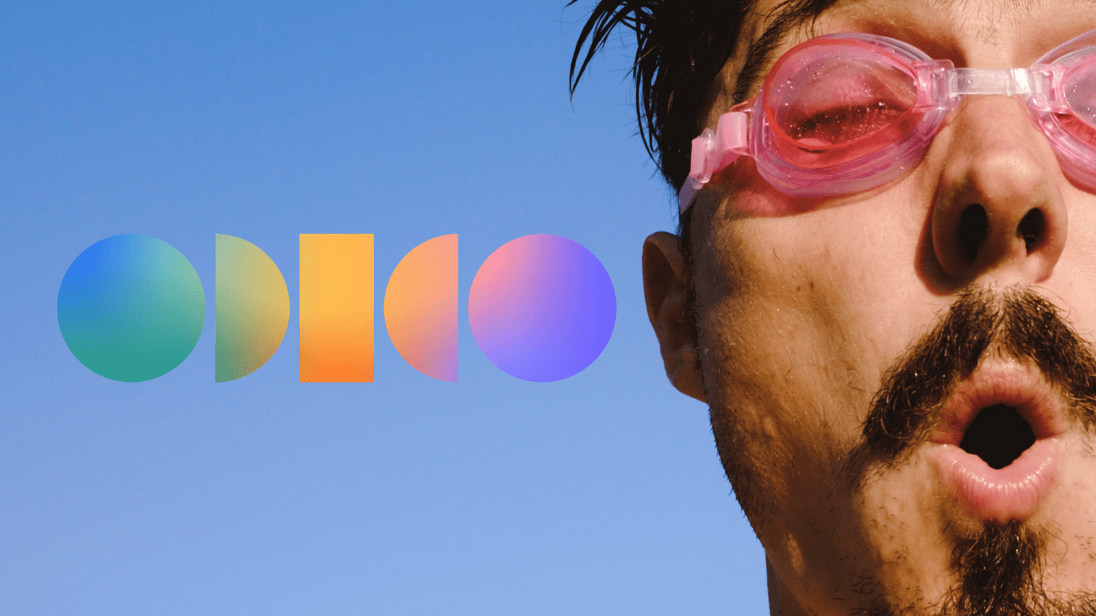
Logo can also be applied on top of imagery. In these instances, use black solid logo on lighter images, and white solid logo on darker images to ensure that there is enough contrast. Never use colour logo on imagery.
Black logo on image
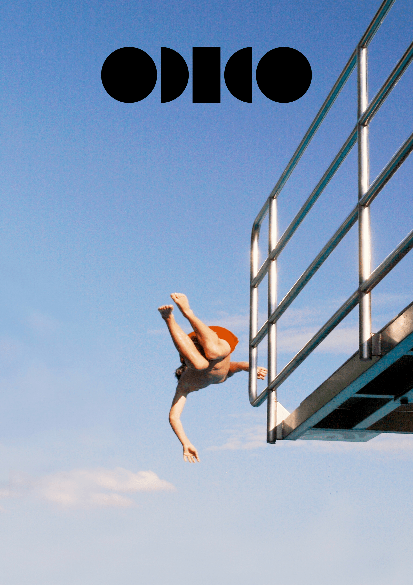
White logo on image
Brand architecture
Overview
Discover the versatility of our logo, tailored for various brand categories. Each lockup is uniquely crafted to ensure distinctiveness across the brand. Below, explore the four main categories.
Sub-labels
Strategic initiatives
Sponsoring
Partnerships
Sub-labels
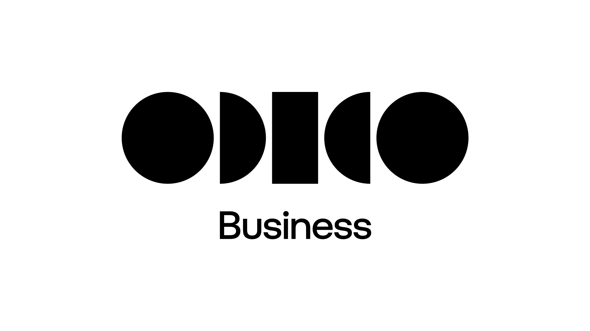
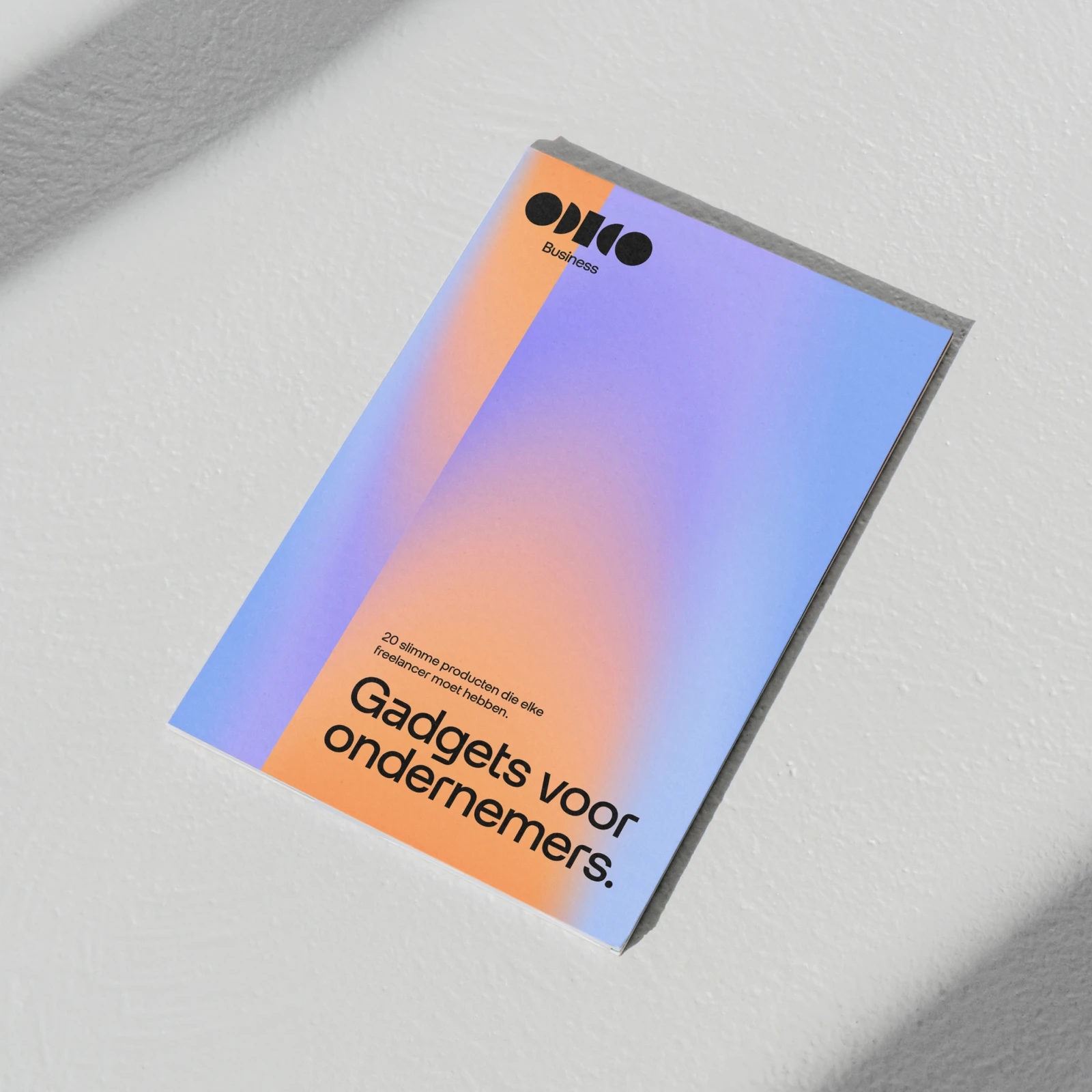
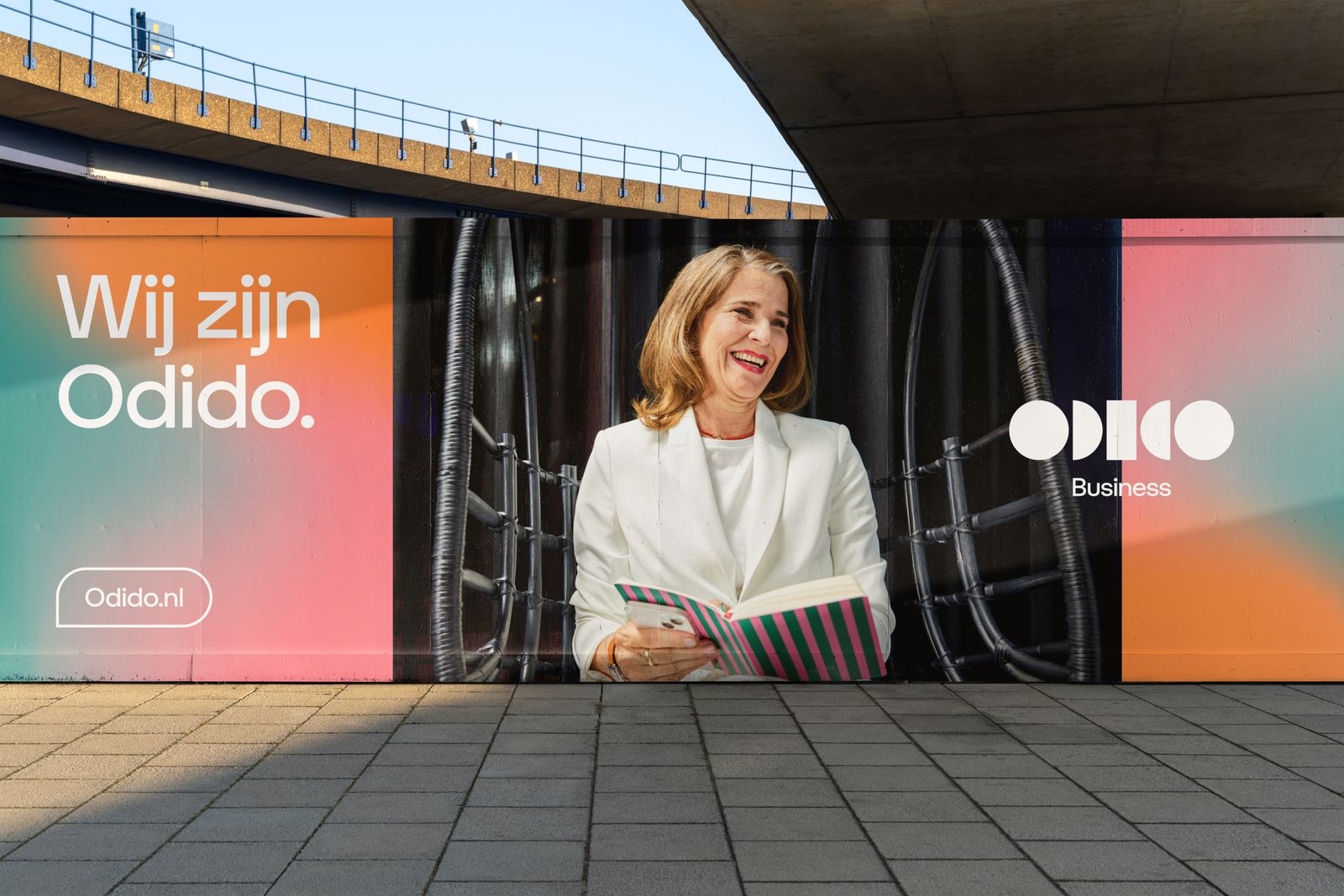
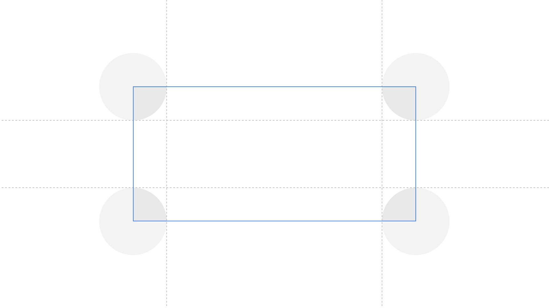
We provide two logo lock-up examples: one for Business and one for Odido.nl. Utilise the grid to effortlessly construct new lock-ups. Use the small version between 134 and 60px.

Strategic initiatives
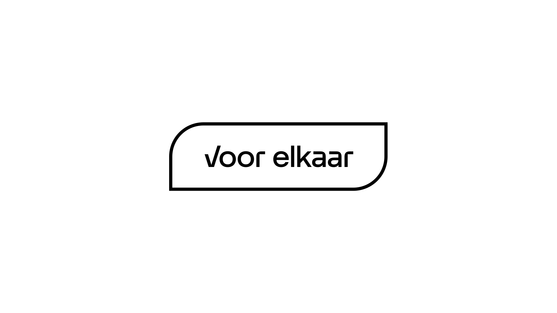
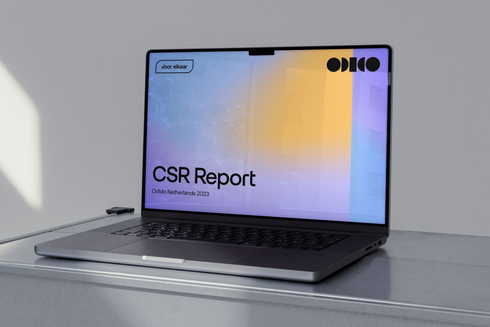
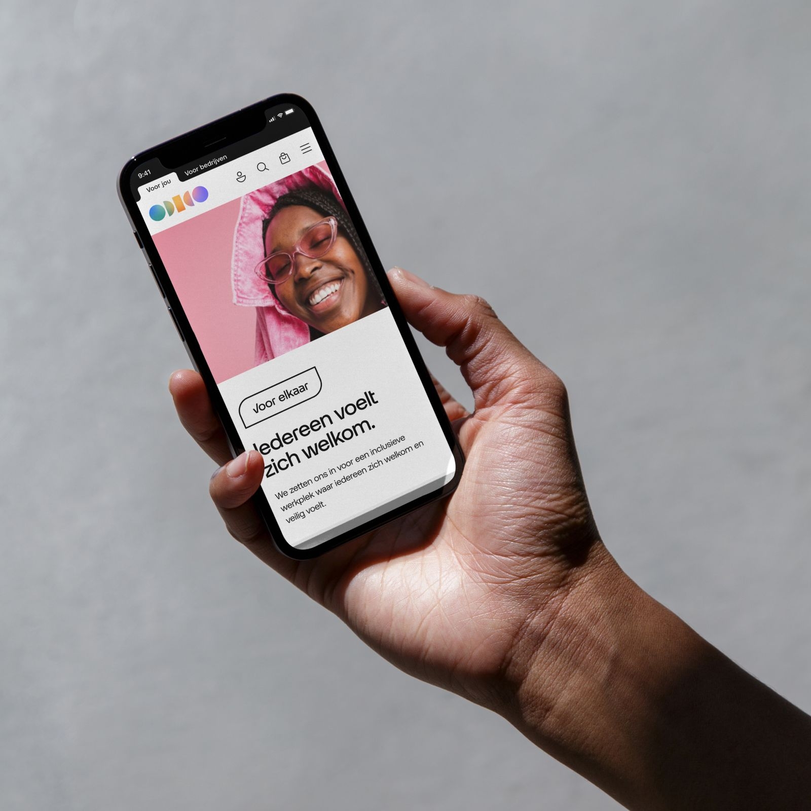
Strategic initiatives are type based, word marks are created with Otypical Headline and are framed in one of our shape. Here is the Voor elkaar sub-brand label using a pill with two sharp corners. Strategic initiatives are used in proximity of the solid logo, but never too close. The size of the label can be bigger than the logo, but never more than twice as big. They can also be used at the equal size.
Sponsoring
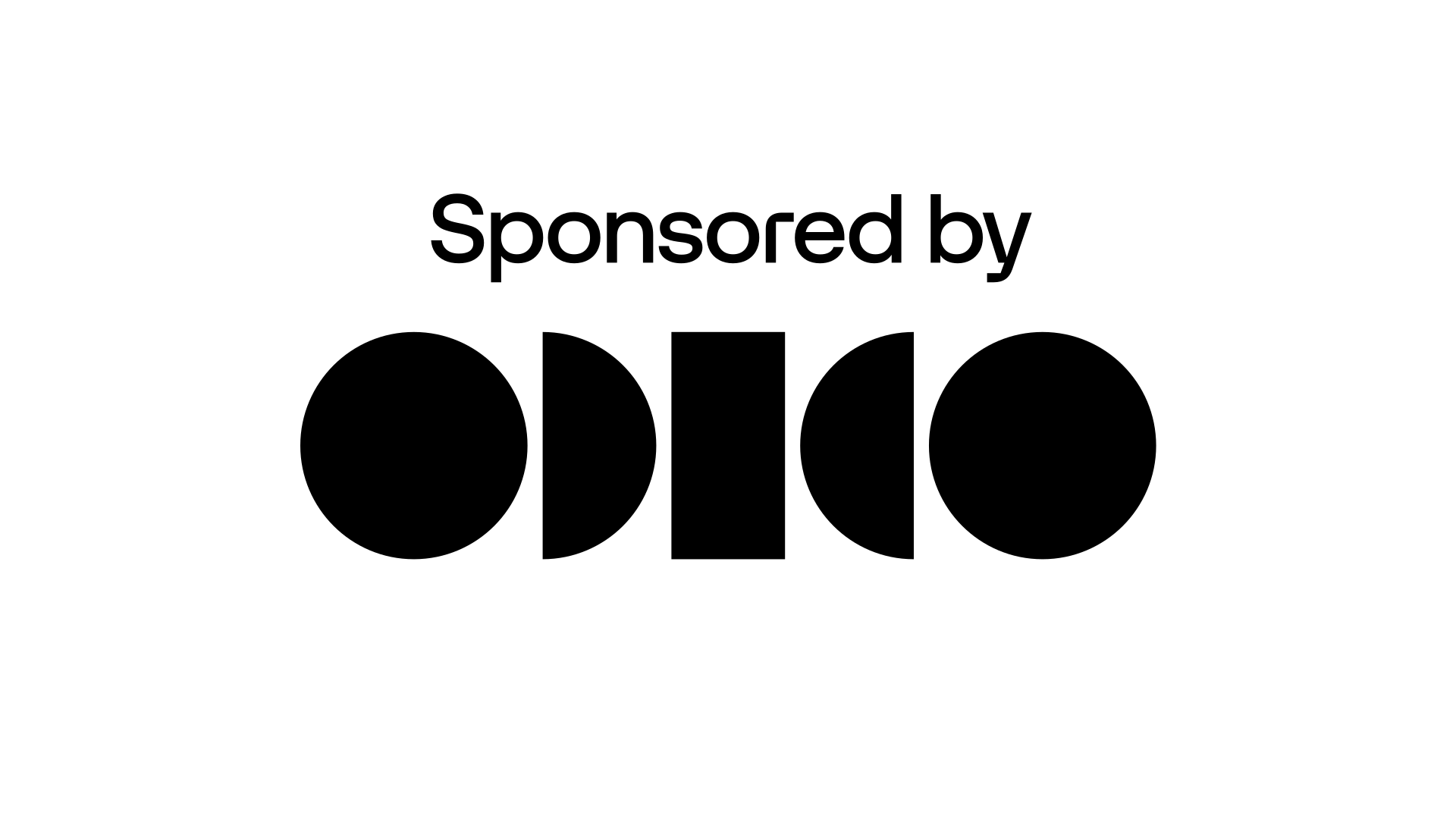
Here is the sponsoring logo lock-up example. Utilise the grid to effortlessly construct this design.
Partnership
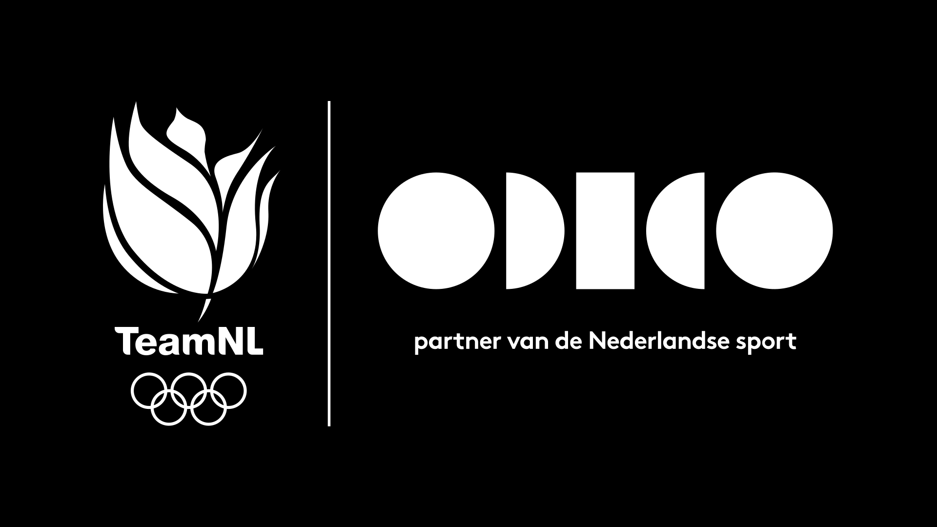
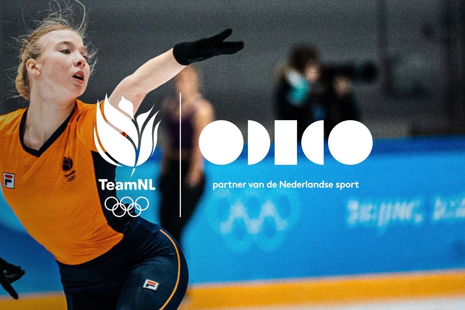
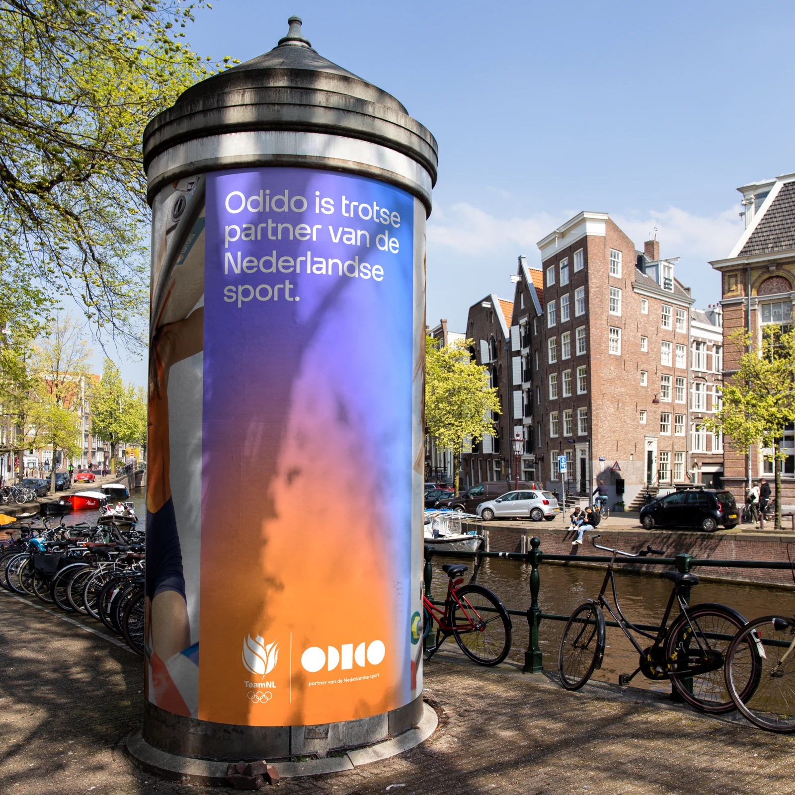
Here is the partnership with TeamNL lock-up example. Utilise the grid to effortlessly construct this design.

Don’ts
Below are some examples that should always be avoided when using our logo.
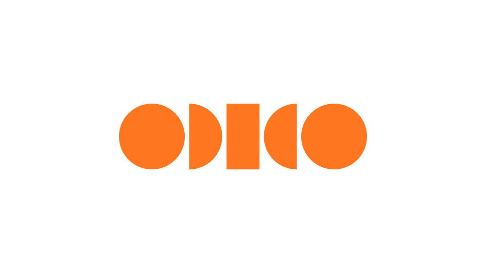
1. Do not apply new colours to the logo.
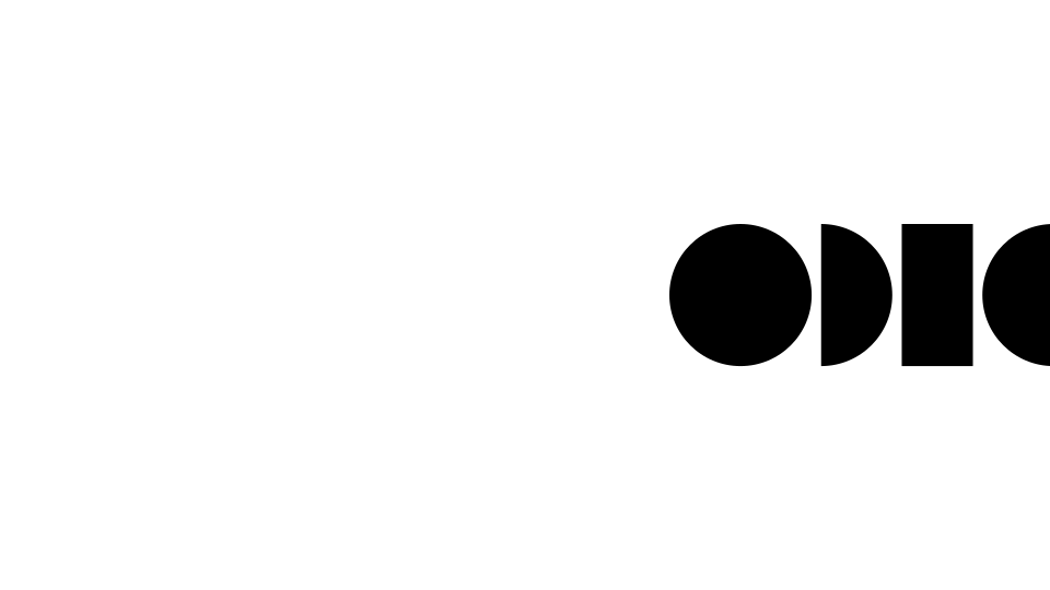
2. Do not crop the logo.
3. Do not apply effects to the logo.

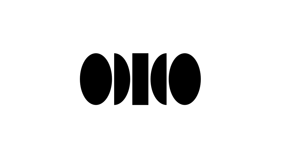
4. Do not change the proportions of the logo.
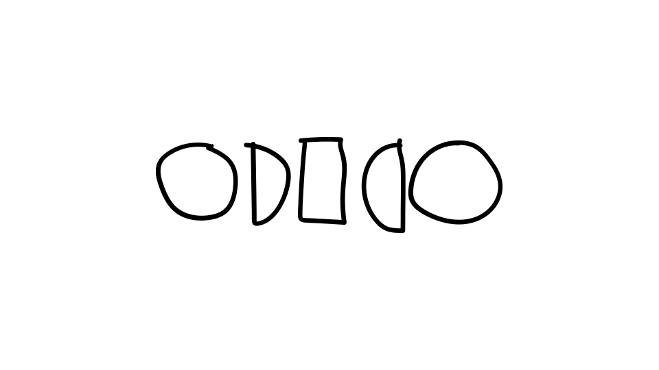
5. Do not recreate the logo.
6. Do not mirror the colour logo.
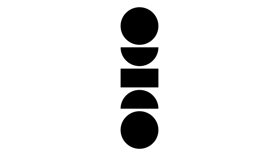
7. Do not change the orientation of the logo.
8. Do not use the colour logo on photography.
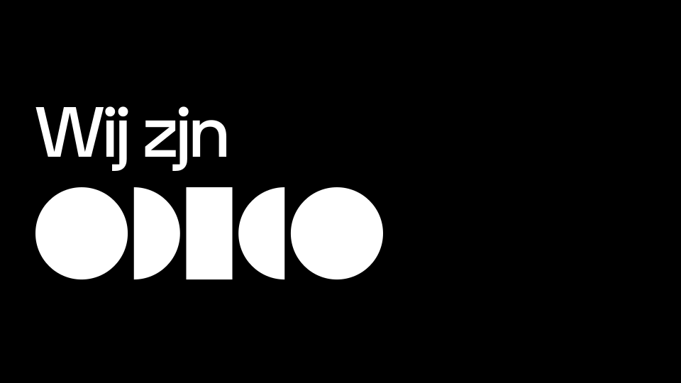
9. Do not use the logo in running text.
10. Do not place the logo on images when contrast is low.
Application
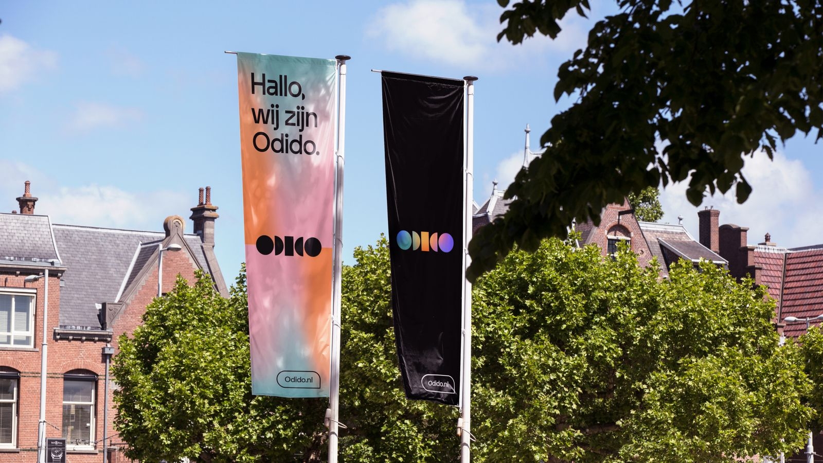
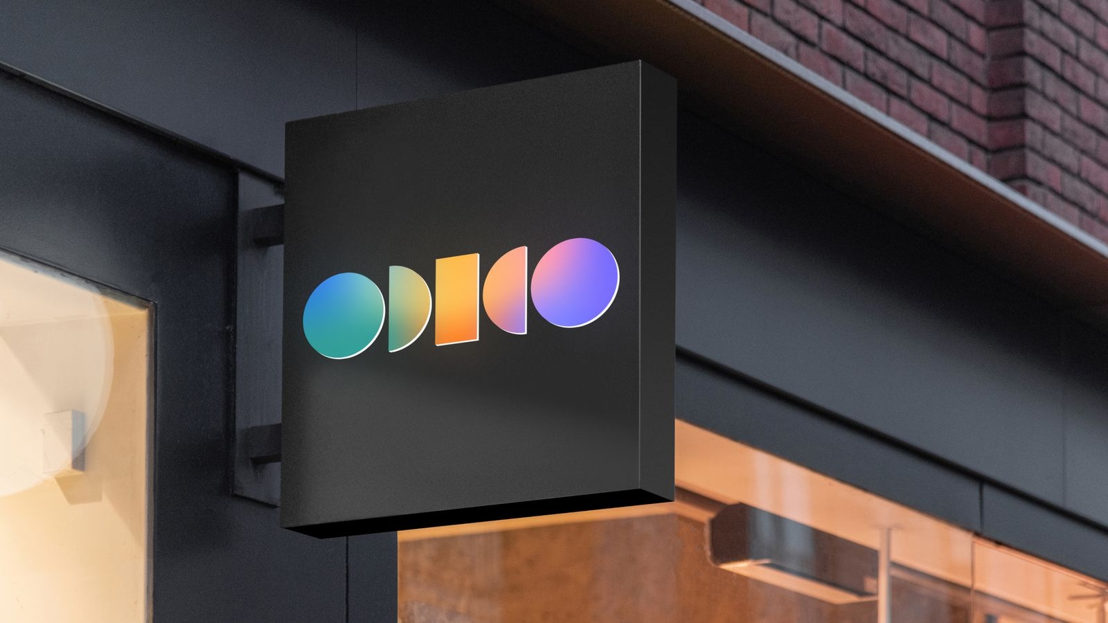
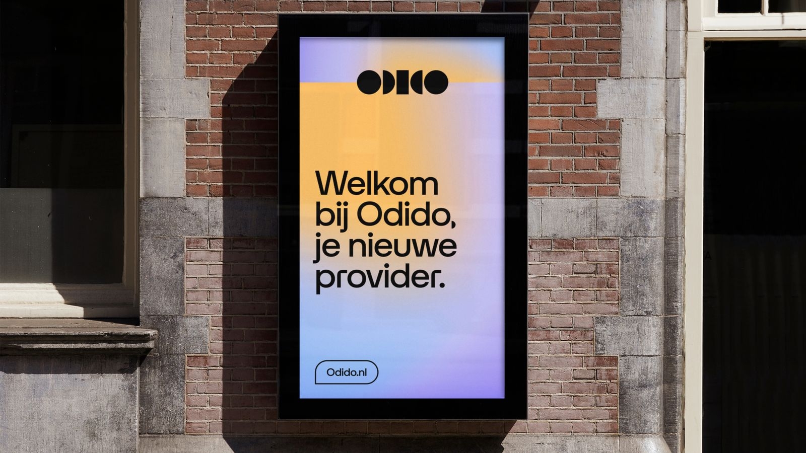
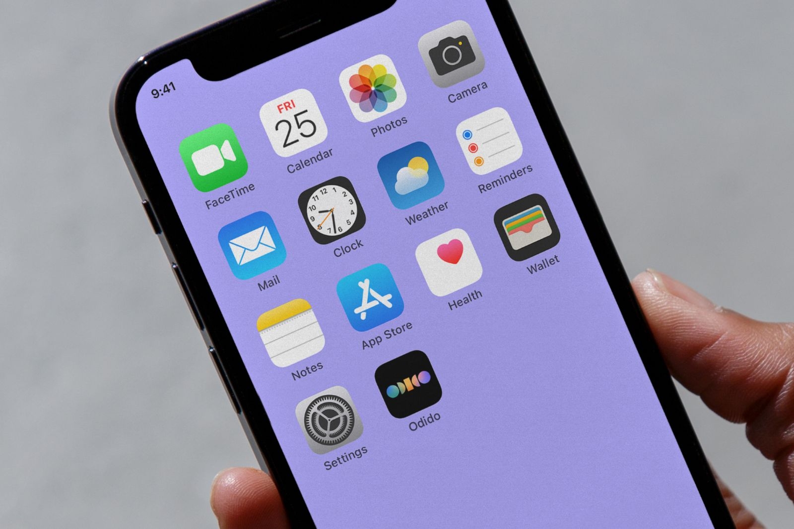
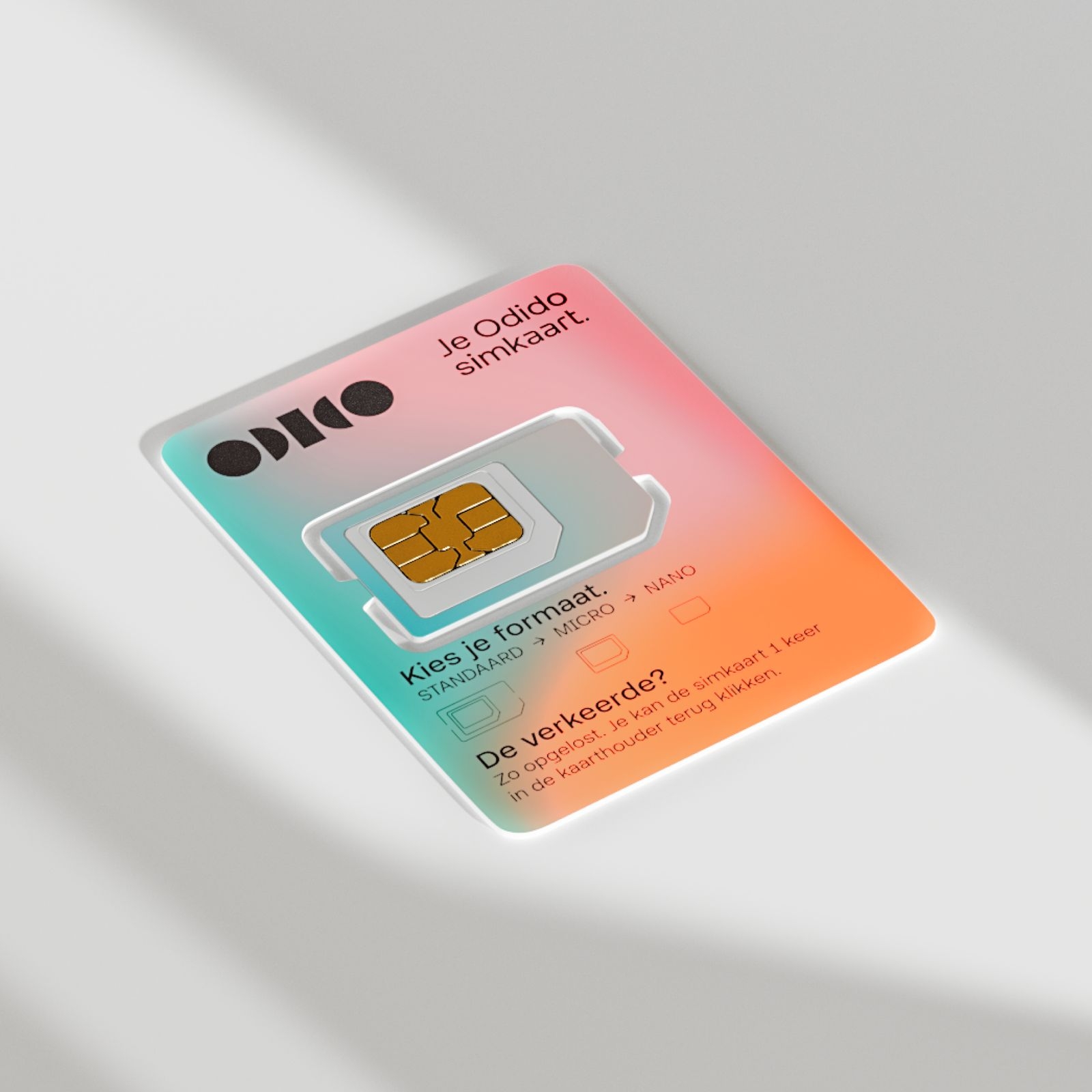
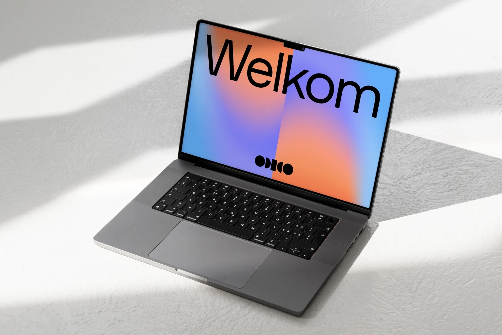
Explore the following examples to see how our logo can be effectively utilised.
Resources
You can download the available B2B logos here.
You can download the available B2C logos here.
Not able to find what you were looking for? Please visit the Resources page.