Illustration
Our illustrations align perfectly with our brand’s purpose by exuding warmth and a human-centric approach. Embracing a modern style, they create joyful and playful connections between technology and people.


Style and colours
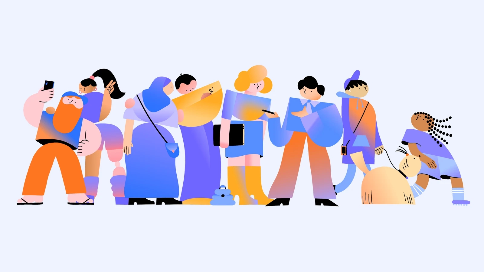
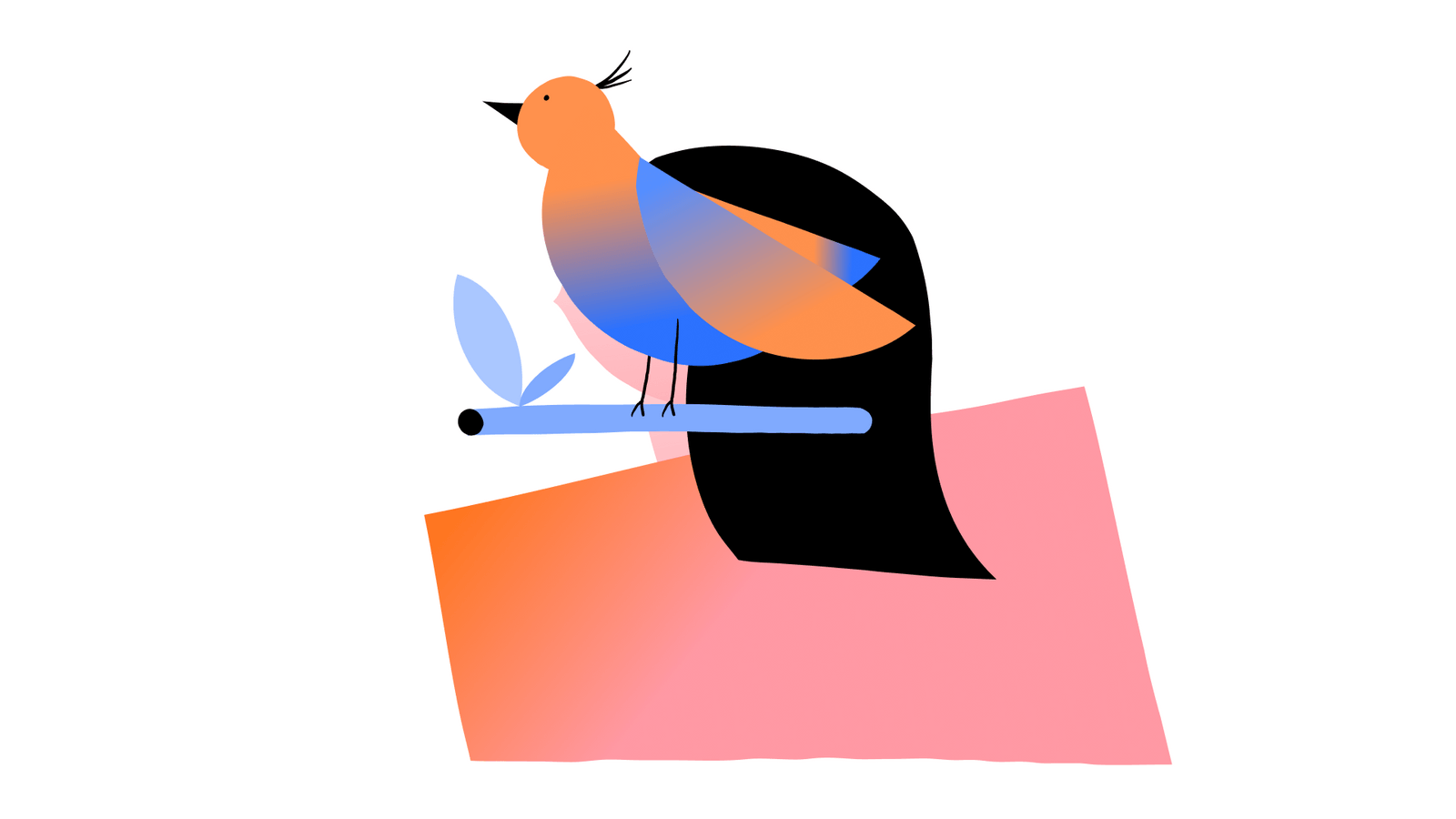
The shapes in the illustrations are skillfully made using our logo as a base. They are enhanced with gradients and colours taken directly from the logo. The characters’ expressions effectively depict various emotions, adding a human and expressive element to the artwork.
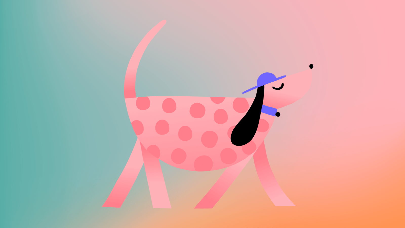
Illustrations style
Take a glimpse into our character creation process.
Skin colours
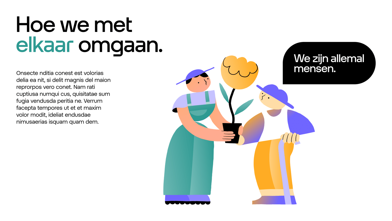
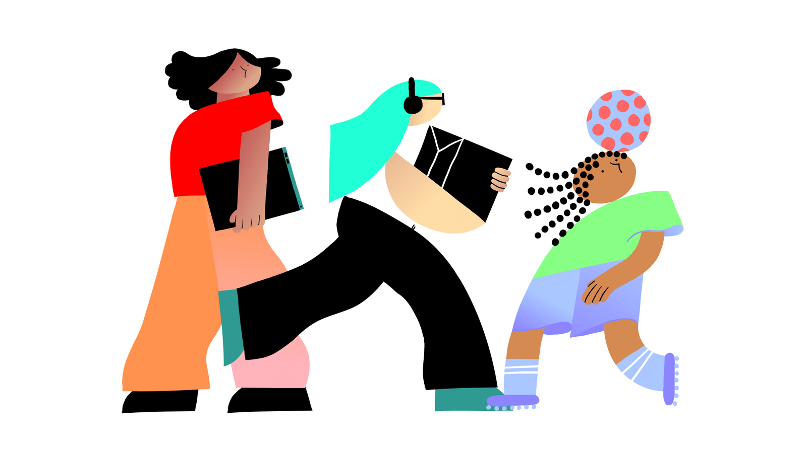
Our characters encompass a diverse range of people and skin colours, celebrating the beauty of a multicultural and inclusive society.
Range
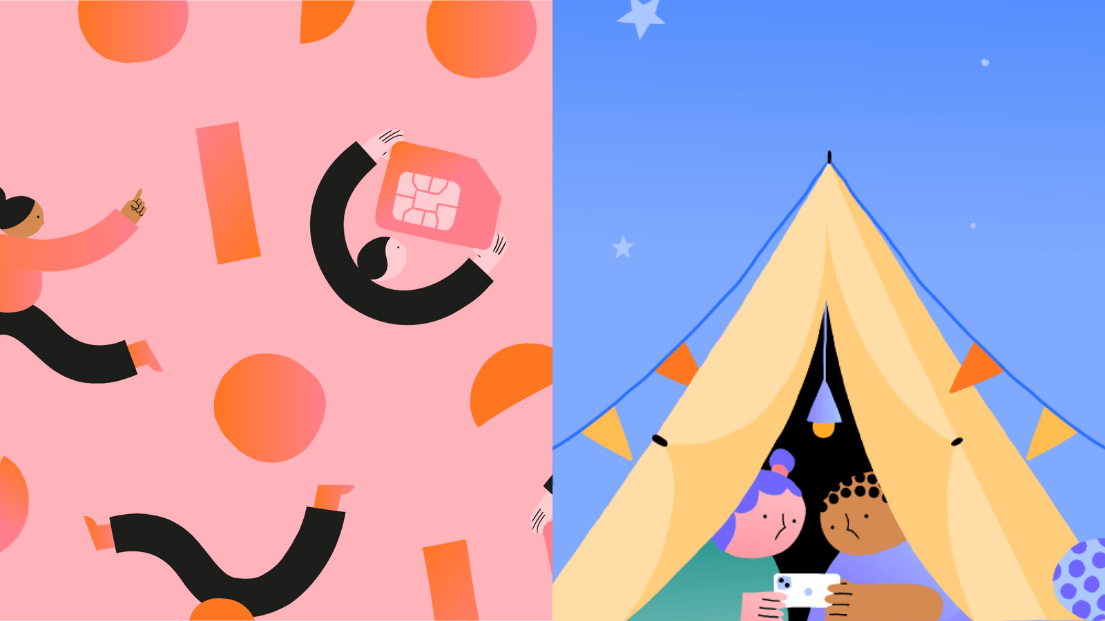
Illustrations are used to express an idea or message in an engaging way. We offer 3 types of illustrations that cater to various situations: spot, support and display.

Spot illustrations
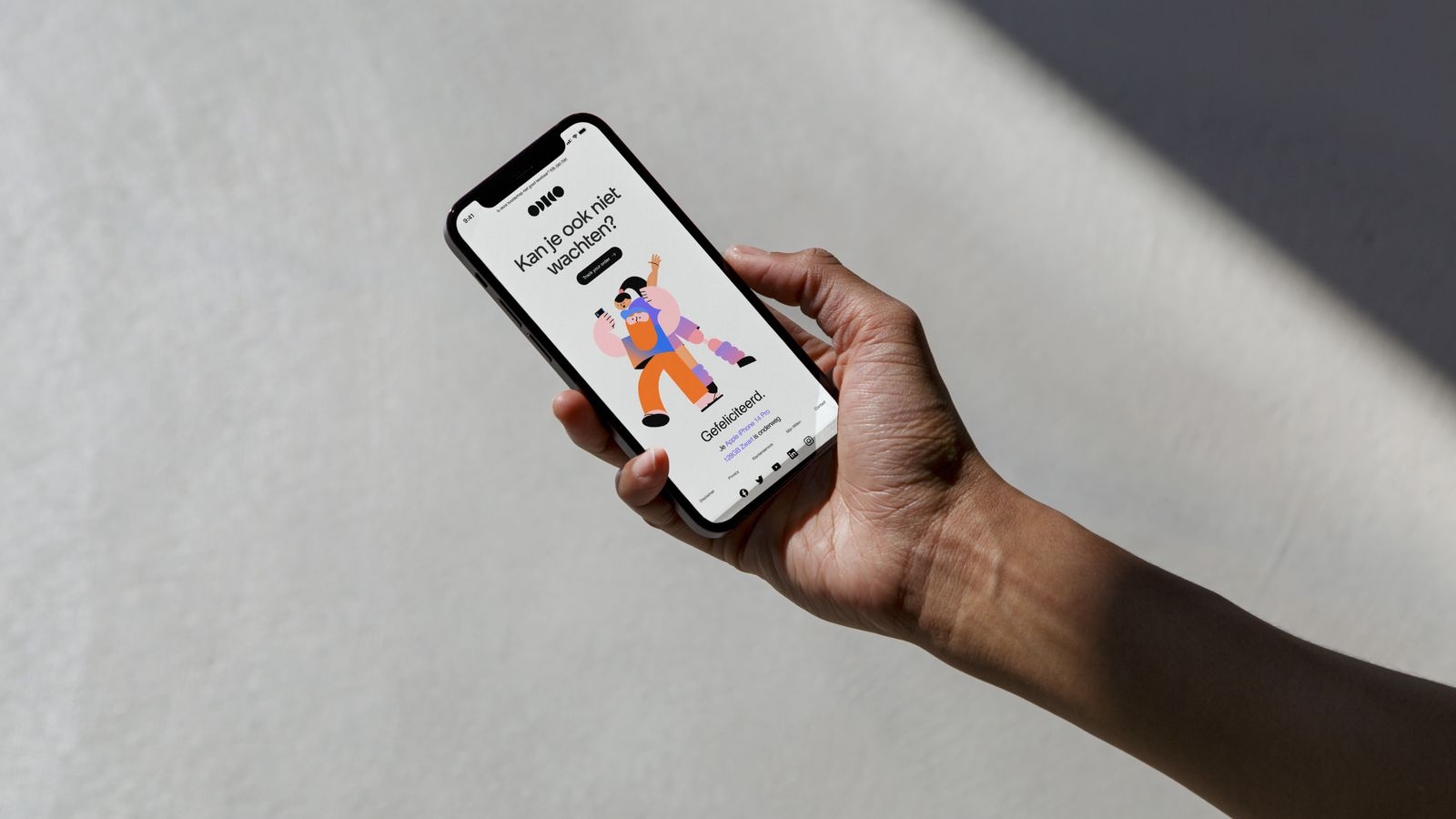
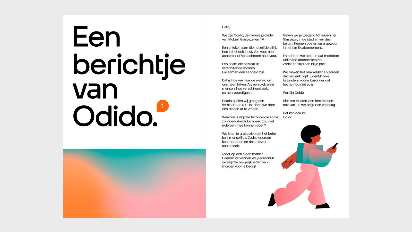
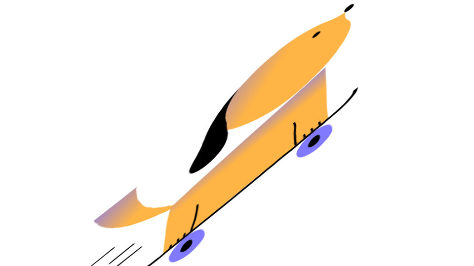
The first type are spot illustrations. They have no background colour and support photography but, can also play a lead role. These are often used within complex layouts next to supporting text.
1. Characters

2. Promotionals

Support illustrations
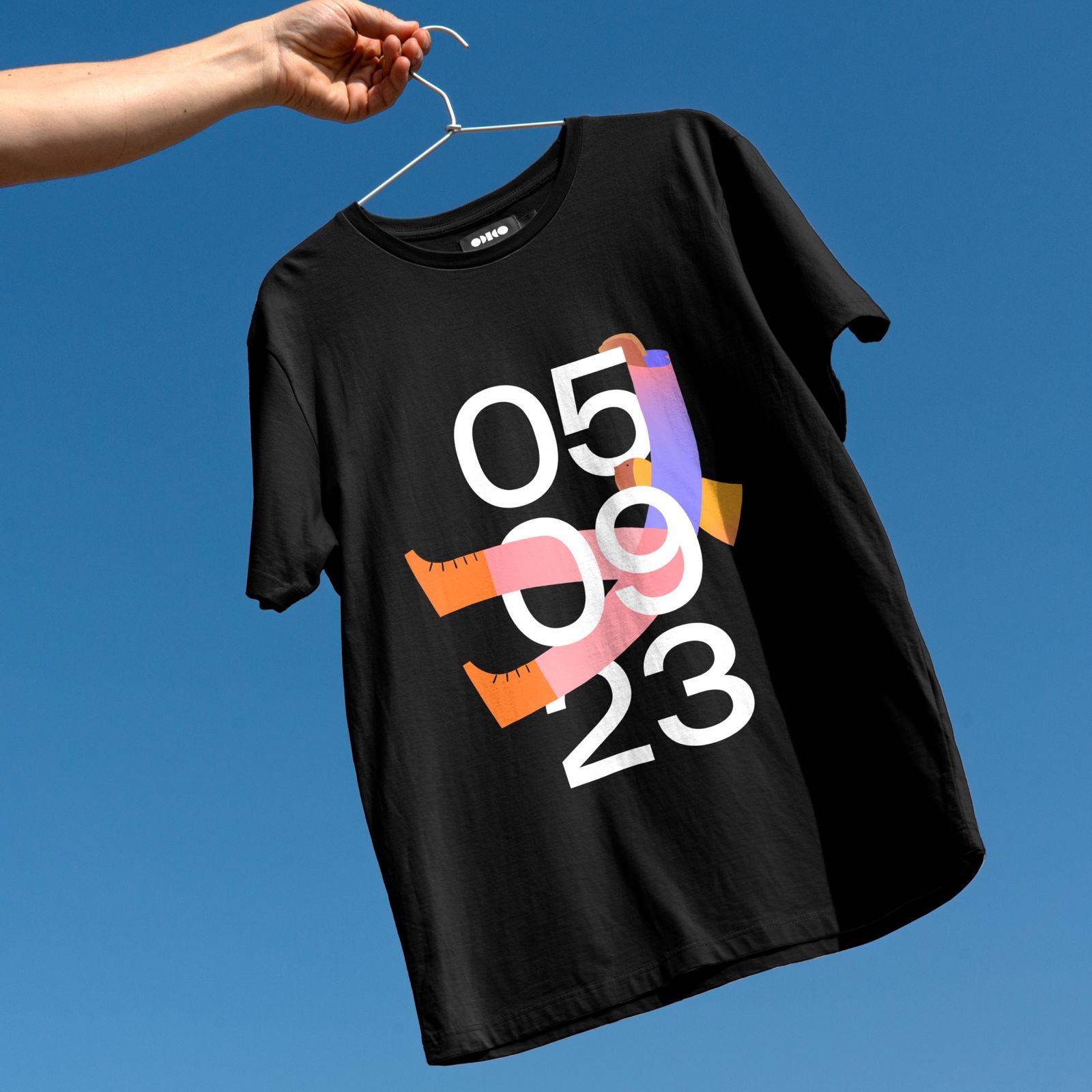
The second type are support illustrations. They are typically small and less detailed. But, they offer important visual cues that enhance the impact of the copy making it more compelling and easy to understand. They can also enhance infographics which help make complex data more accessible.
1. Devices

2. Micros

Display illustrations
The third type are display illustrations. These are the largest and are reserved for large formats. They’re used as wallpapers or to replace photography when a sensitive topic needs to be communicated without selecting a specific time, place or person.
1. Wallpapers

2. Stories


Applying illustration
Combining illustation and glow
The lead element should be the Glow. The illustration that follows should use at least one dominant colour from the Glow. Use these examples to master the art of matching illustration with the Glows.
Step one

Step two
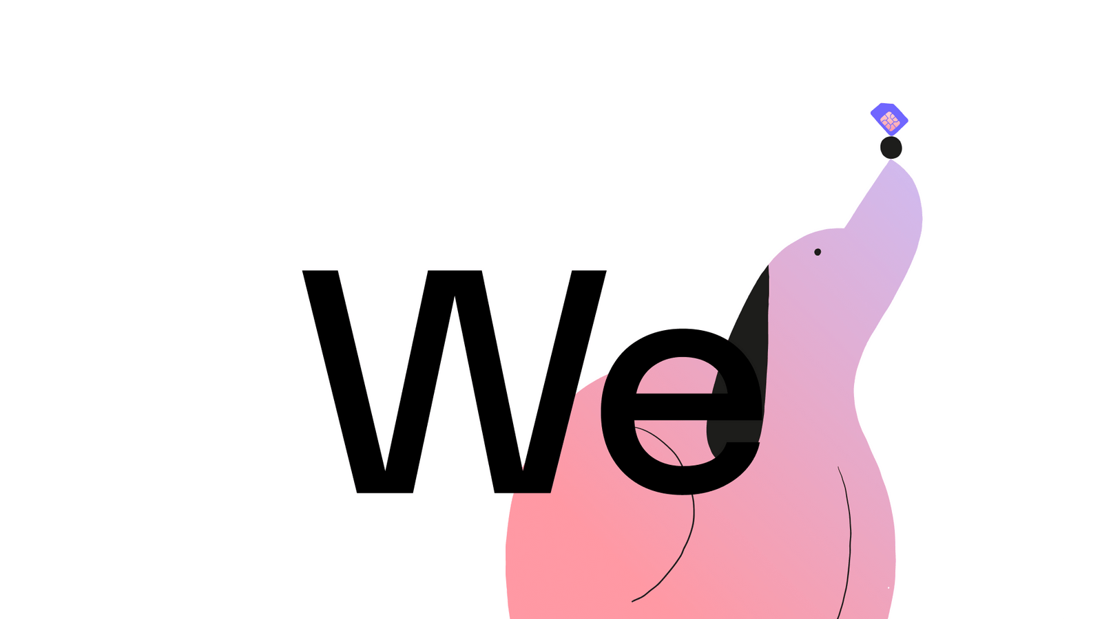
Combining illustation and type
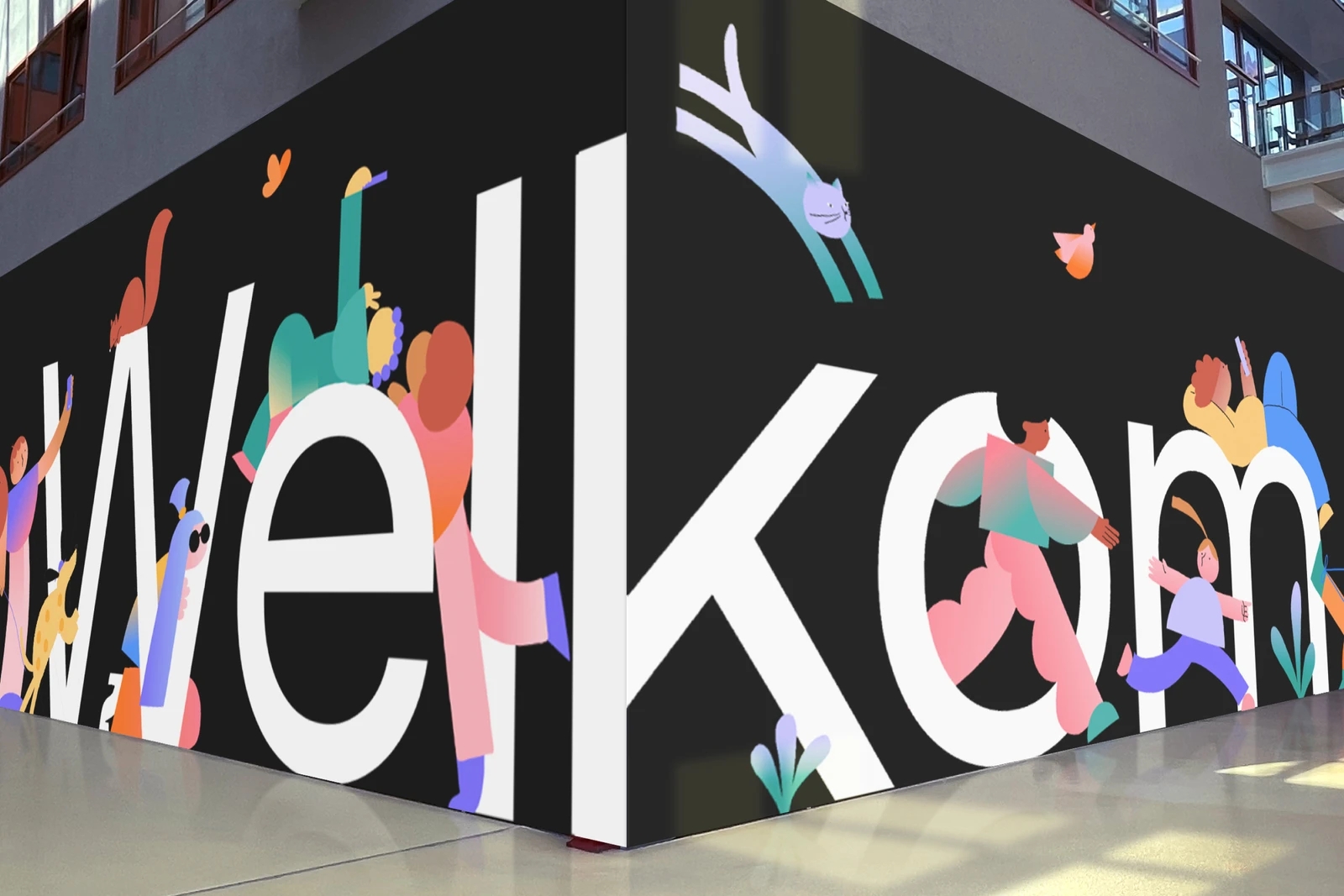
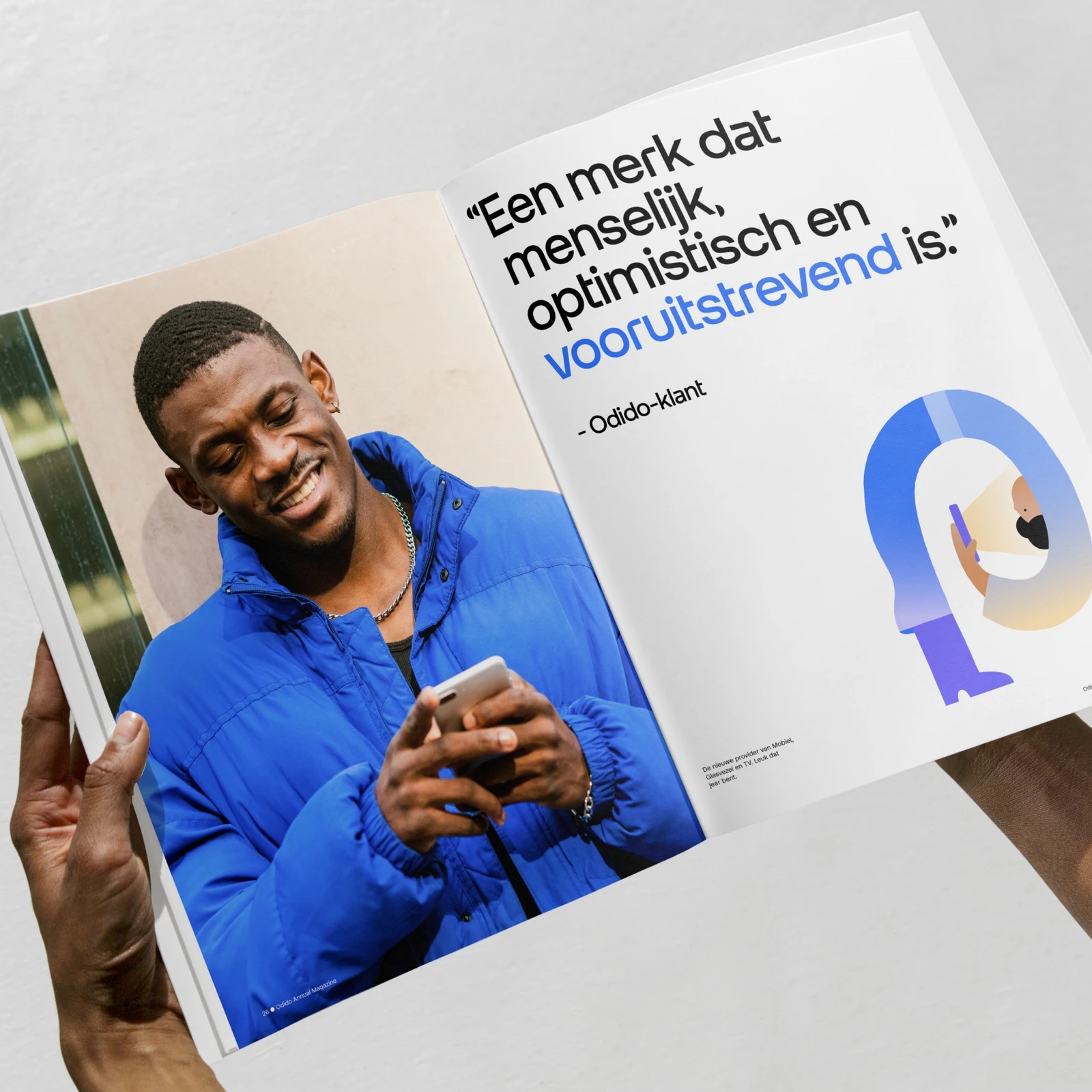
When combining illustration and type, make sure to play with contrast to create a balanced composition. If the illustration is large, the type should be small. If the type is large, the illustration should be small. In special cases the illustration and type are both leading. The illustrative elements and letter shapes then interconnect to create an artwork.
Combining illustration and shapes
When combining illustration with shapes, a speech bubble can interact with the illustration and a tile can be used as a container. Make sure to match the shape’s colour after the illustration.

Combining illustration and iconography
When combining illustration with icons, create contrast between them by hero-ing the illustration and using the icons as small, support elements. On the same layout, always use icons at least 2x smaller than micro illustrations. Make sure to match the icons colour after the illustration.

Combining illustration and photography
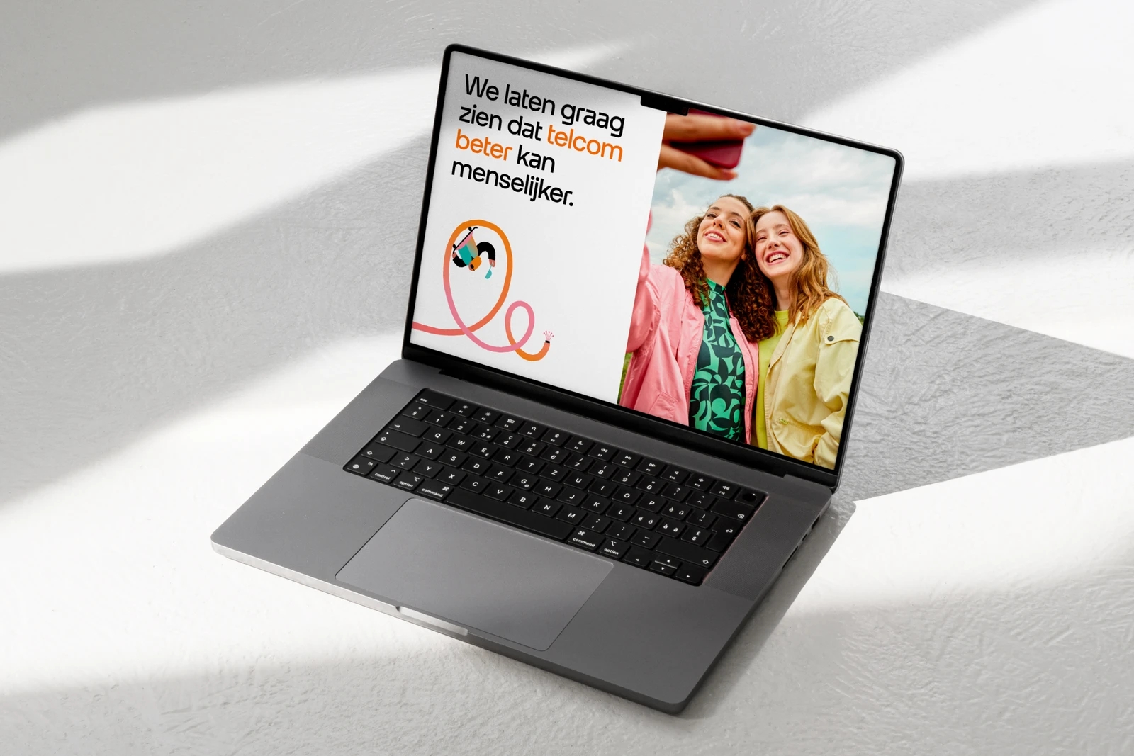
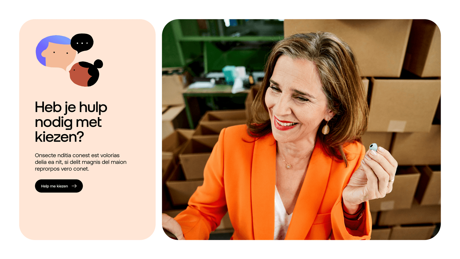
When combining illustration and photography inside a layout, the photography should stay the hero whilst the illustration supports the content.
Combining illustration and masked logo
The masked logo can be created with illustration, especially with the characters. The latter have to be prominent with most elements masked in the logo and with a few elements going out of the logo to create depth.
Don’ts
Below are some examples that should always be avoided when using our illustrations.
1. Do not rotate or alter the original intention of the concept.
2. Do not combine multiple illustrations from different ranges.
3. Do not overlap illustrations.
4. Do not abstractly crop the artwork or add additional elements or text.
5. Do not modify colour.
6. Do not use illustration on Glows if there’s not enough contrast.
Application examples
Explore the following examples to see how our illustrations can be effectively utilised.