Shapes
Our logo forms the base of our shapes language. We use shapes to create lively and optimistic compositions that reflect human communication.


Family
Four shapes
Introducing our diverse family of shapes – pill, speech bubble, tile and speech tile. The pill is used for one-line buttons, or extended – as a tile – for longer copy usage. The speech bubble is used for call-to-actions (like the url), the pay off or small dialog up to 3 lines. For longer copy usage, the speech tile is used.
1. Pill

2. Speech bubble

3. Tile

4. Speech tile

Construction
Full rounded corners and scalability
For pills and speech bubbles our rounded corners are full at all times. This means that radius corners are always 50% of shape height, and are scaled up or down following the shape’s size. Use a maximum of 2 different sizes per layout and touchpoints.

Large rounded corners and scalability
For tiles and speech tiles, our rounded corners are prominent to add playfulness to layouts. Inside the same (or similar) layout and touchpoint, we have absolute radius corners. This means we use one single value for all radii.

Usage
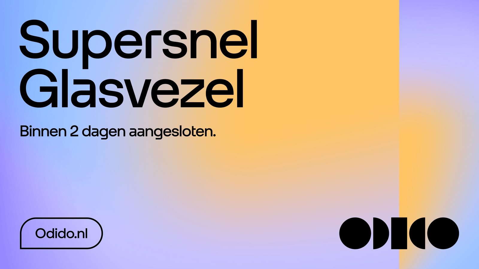
Pill usage
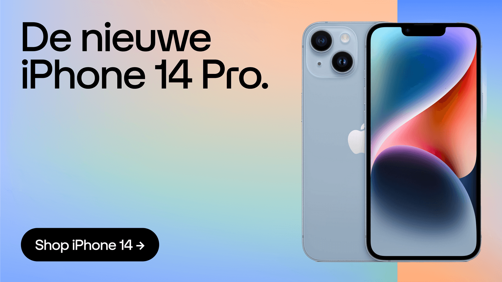
The pill is used as a container for one line copy, for a CTA, or a button. It extends horizontally to fit the copy and should always have full, rounded corners on horizontal sides.
Single for CTA or button

Pill usage examples
Discover inspiring applied examples showcasing the correct and creative use of our pill. Paired with an arrow from our glyphs or iconography it creates an impactful result.

Speech bubble usage
Explore the versatility of our speech bubbles, including a single that’s used for a URL or short info and tips. Overlapping, double speech bubbles are used for a pay off or if a CTA is paired with a URL. Stacked speech bubbles are used for dialog.
Single for URL or information

Double overlapping for pay off or info URL

Stacked for dialog

Speech bubble usage examples
Explore inspiring, creative examples of our speech bubbles. For dynamic visuals, use stacked bubbles - especially for visualising dialog and when there’s plenty of white space to play with.
Tile usage
Explore the versatility of our tile which can be used for headline and longer copy and/or as a imagery container. When stacked together, pills can create a masonry layout which can be used on the Functional level.


Tile usage examples
Explore inspiring, creative examples of our till in use. When utilising multiple shapes, ensure a harmonious balance between text, images, and bold typography.

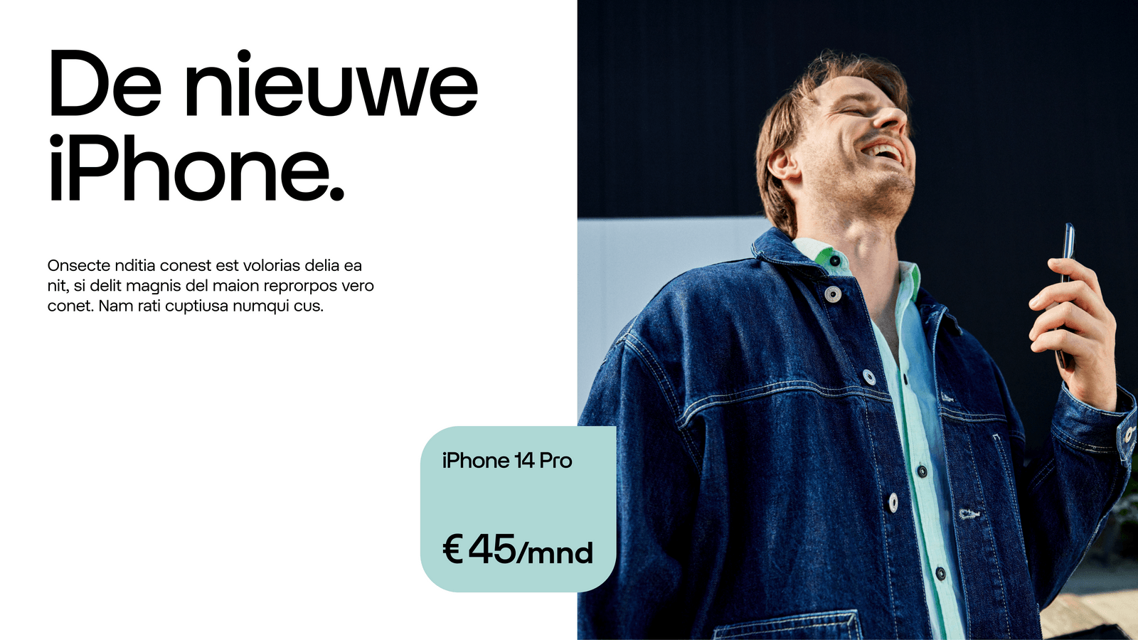
Speech tile usage
In rare cases, a speech tile can be used for catchy messages and longer informative or educational copy, for example price stickers or longer tips.
Price stickers or tips

Speech tile usage examples
Explore inspiring, creative examples of our speech tile. Use sparingly.

Don’ts
Below are some examples that should always be avoided when using our shapes.
1. Do not use speech bubbles if the copy is not a dialog.

2. Do not use the speech tile as a container for imagery.

3. Do not place an imagery tile fully on the Glow.

4. Do not use overlapping speech bubbles for headlines.

Shapes placement
Pill and speech bubble sizing
When possible, use the same height size as the logo that’s used inside the same layout or touchpoint. If you can’t align with the logo size, then create contrast.

Sharp corner direction
The default direction of a single speech bubble should point to the bottom left, meaning the bottom left corner radius is 0. When the speech bubble is placed in the corner, the direction points to that relative corner. For a double speech bubble, the first speech bubble should point to the bottom left, whilst the second speech bubble points to the bottom right.

Combining logo with payoff or url
The payoff or URL should follow the logo colour. When the URL is on its own, then it should be outlined. When the payoff is used, then the first speech bubble should be outlined and the second one with the name is filled.
Overlapping speech bubbles
The second speech bubble is always on top of the first speech bubble. The intersection of both is at the centre of the bottom and top inset for the first and second speech bubble, respectively.


Large rounded corners sizing
For large, rounded corners use the same radius as the logo, the pill, or a speech bubble place inside the same layout or touchpoint. This will help create consistency across radii. When there are no references to base the radius on, the first radius value should be 10% the width of a square - given that this square is at least 1/2 of the longest side of the format. Once the first radius is set, then all other tiles and speech tiles should be based on that radius.
-1.svg)
Don’ts
1. Do not use different rounded corners for tiles.

2. Do not align horizontally overlapping speech bubbles.

Type placement
Type placement of pill
One line of copy is placed inside a pill and a speech bubble with an horizontal inset value equal to 100% of the copy size, and a vertical inset value equal to 67% of the copy size. A maximum of one line of copy is used inside a pill.
Copy size: 36 Inset spacing: H36 V24

Copy size: 36 Inset spacing: H36 V24

Type placement speech bubble
Two or three lines of copy are placed inside a speech bubble with a horizontal and vertical inset (padding) equal to 100% of leading and never below the copy size.
Copy size: 24 Leading: 29 Inset spacing: 29

Copy size: 24 Leading: 29 Inset spacing: 29

Copy size: 36 Leading: 32 Inset spacing: 36

Copy size: 36 Leading: 32 Inset spacing: 36

Copy size: 60 Leading: 54 Inset spacing: 60

Copy size: 60 Leading: 54 Inset spacing: 60

Type placement of tile and speech tile
Copy is placed inside an extended pill or speech bubble with an inset (or padding) equal to 100% of leading.


Homogenisation
When facing an intricate layout, like a masonry layout, homogenisation of all insets is necessary. Copy should then be placed inside a tile with a minimum inset (or padding) equal to the radius of the rounded corners.


Application examples
Explore the following examples to see how our shapes can be effectively utilised.


