Typography
Our typography is simple and celebrates the beauty of our bespoke typeface Otypical, a geometrical and human sans serif.


Family
Headline and Text
There are two styles, Headline and Text. Headline is a show-stealer. Details are pushed to the max to create a lasting impact on the reader. Text is a toned-down version of Headline to ensure legibility and accessibility even in small sizes.

Characters set
Use this block to showcase all characters within the headline.
Preview
Use this block to show and interact with typography.
Usage
Below are examples of when Headline and Text should be used. In general, for any copy above 24px in size, Headline should be used. For anything below 24px, Text should be used to maximize legibility.
Type hierarchy
Hierarchy between our typefaces is important. In the same document or composition, Headline should always be bigger than Text - at least 40% larger. If it’s not, then something is wrong.

Type setting
Alignment
The preferred alignment is left-aligned. Use center alignment as little as possible. Do not use right-aligned or justified typography.
Left-aligned headline
Left-aligned headline and body copy
Centered headline and body copy
Sentence case
Sentence case should always be used unless working with a tagline or different tiers of information. The examples below set out the rules for capitalising typography.
Tracking
Tracking should be tight. In Headline, tight tracking is set so that it looks ideal in a large size. This means positive tracking needs to be added when Headline is used in smaller sizes. Below are some examples to help guide tracking.
Headline 80px | Tracking: 0
Headline Below 40px or 30pt | Tracking: 1% or 20
Text 24px | Tracking: 0
Text Below 18px or 14pt | Tracking: 1,5% or 20
Kerning
Kerning has been set considerately by Cotype and no manual kerning should be necessary. Always set kerning on Metrics for the best result.

Headline leading
Headline leading should be generally tight. The safe option for all headings is 100%. However, if copy allows it to happen, we favour tighter leading. This depends on the number of descenders and ascenders and where they are positioned within the combinations of letters.

Body copy leading
Body copy leading is optimised for maximum readability and accessibility. This should always be set at 120%.

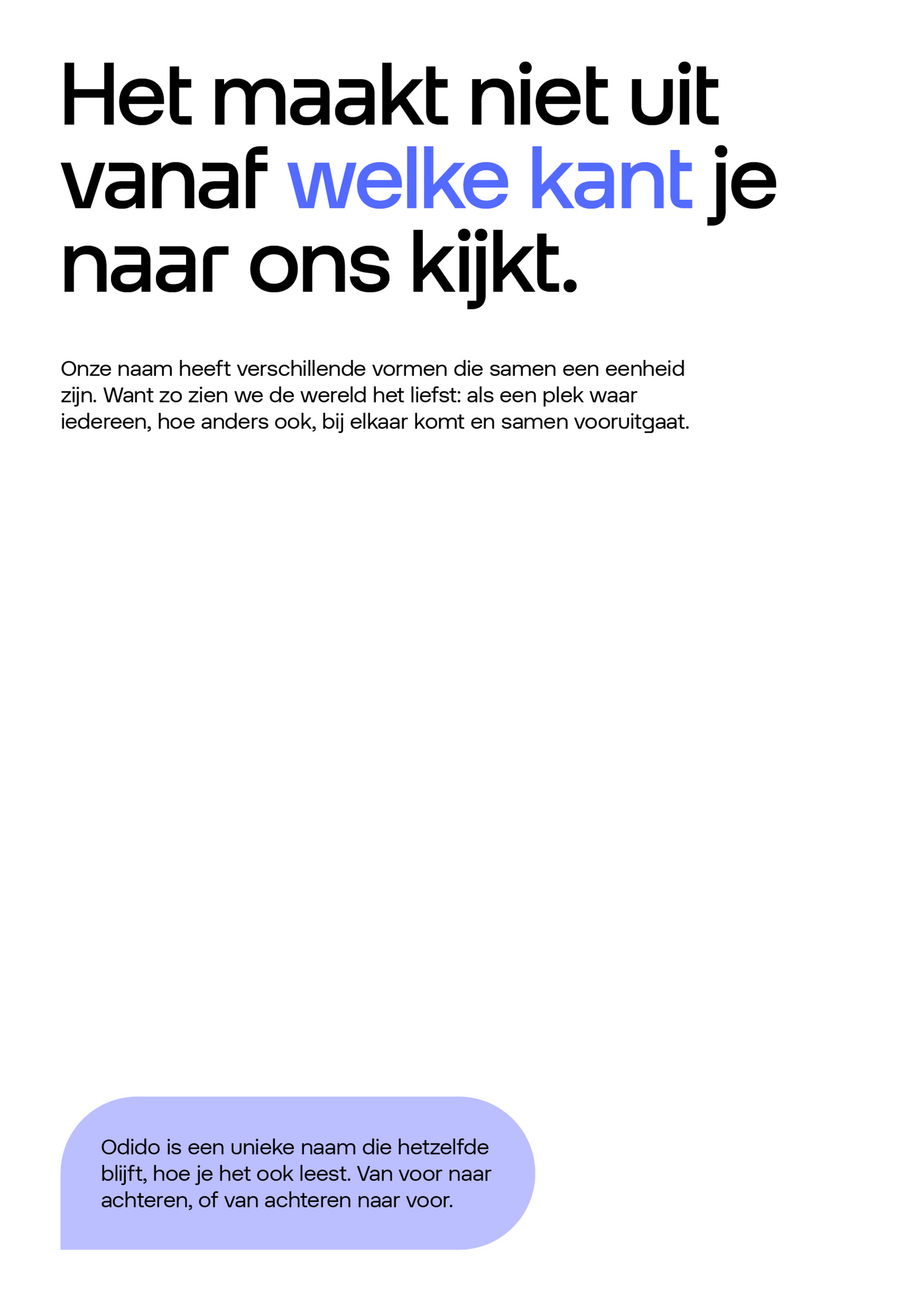
Quotes
We write quotes using the half-circle quotation marks included with Otypical Headline Medium. Highlighting text is possible with one of the head colours. The name is set with Otypical Headline Regular.

.svg)
Smart headline features
Otypical Headline has smart features built-in, therefore the standard ligatures should always be on. If the discretionary ligatures are on, then other features will appear, a few sets are also available in the OpenType features.


Text features
Otypical Text has some smart features built in so the standard ligatures should always be on. Although, a few manual settings are necessary.

Fallback typeface
Arial is our fallback typeface when it is not possible to use Otypical. We use Arial Regular and Bold, as well as the italic.
Don’ts
Below are some examples that should always be avoided when setting type.
1. Do not use justified type.

2. Do not use right-aligned type.

3. Do not use title case.

4. Do not use all uppercases.

5. Do not use all lowercases.

6. Do not use an alternative typeface.

7. Do not combine different weights within the same block.

8. Do not let ascenders and descenders touch.

9. Do not use negative tracking.

10. Do not use excessive positive tracking.

11. Do not apply drop shadows to type.

12. Do not use outline on type.

Type colour
Typography should be black or white. The secondary colour palette can be used to highlight certain words within the headline or sub-headline. However, only hues should be used for this. The body copy is always black.

Don’ts
Below are some examples that should always be avoided when using colour with type.
Do not highlight different letters in a single word.

Do not colour the body copy.

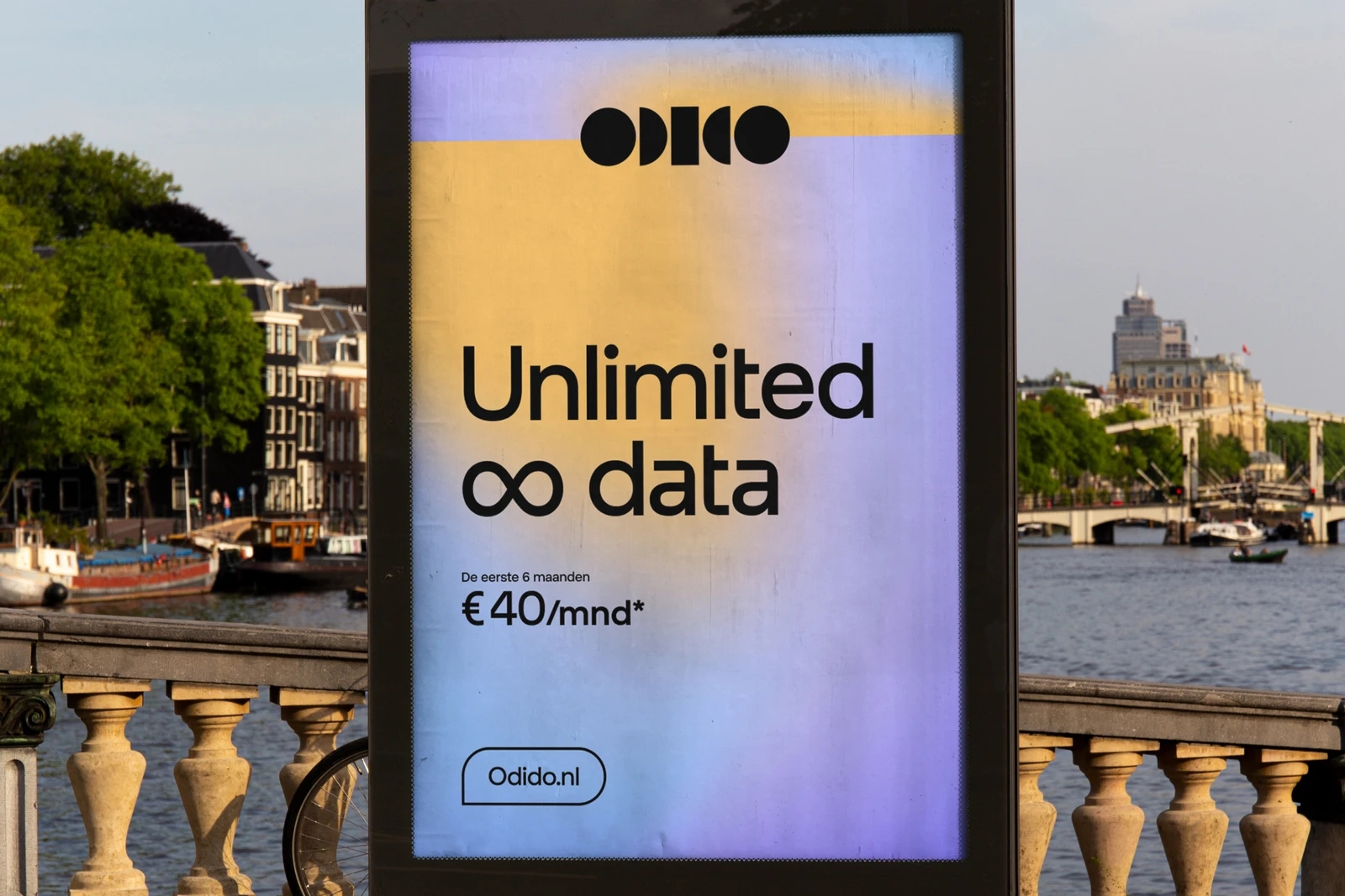
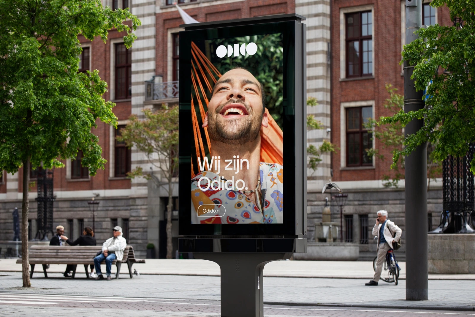
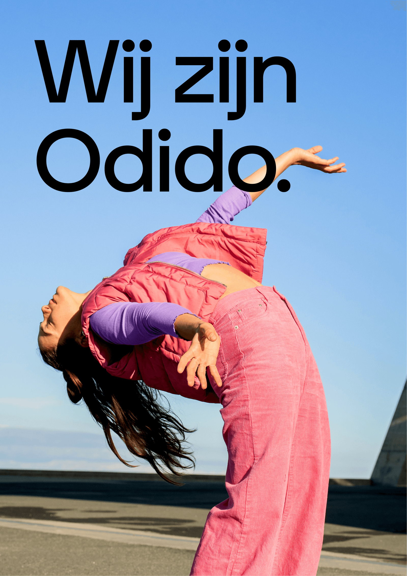
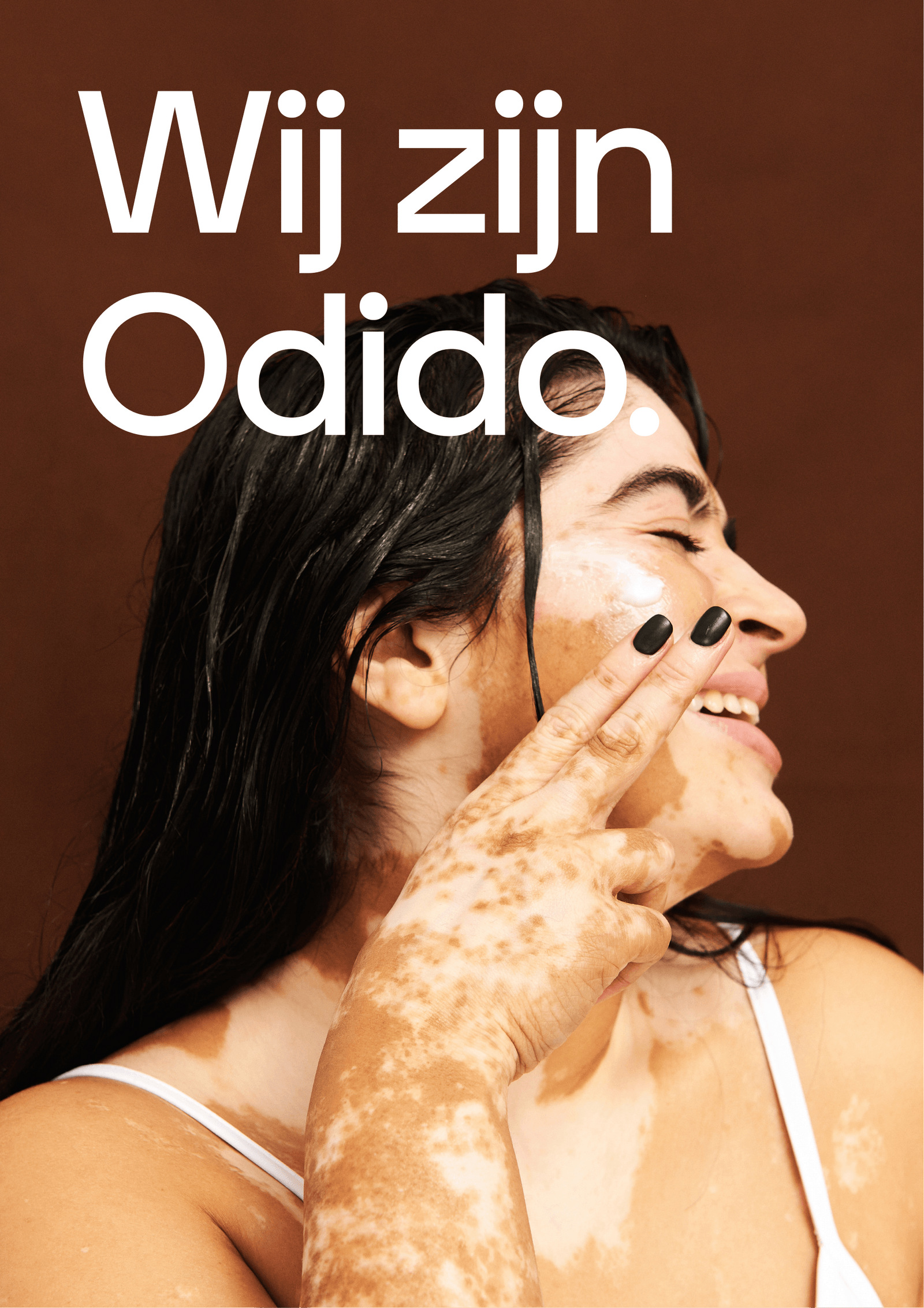
Type on image
Typography can also be applied on top of imagery. In these instances, use black typography on lighter images, and white typography on darker images to ensure that there’s enough contrast. Never use color typography on imagery.
Black type on image
White type on image
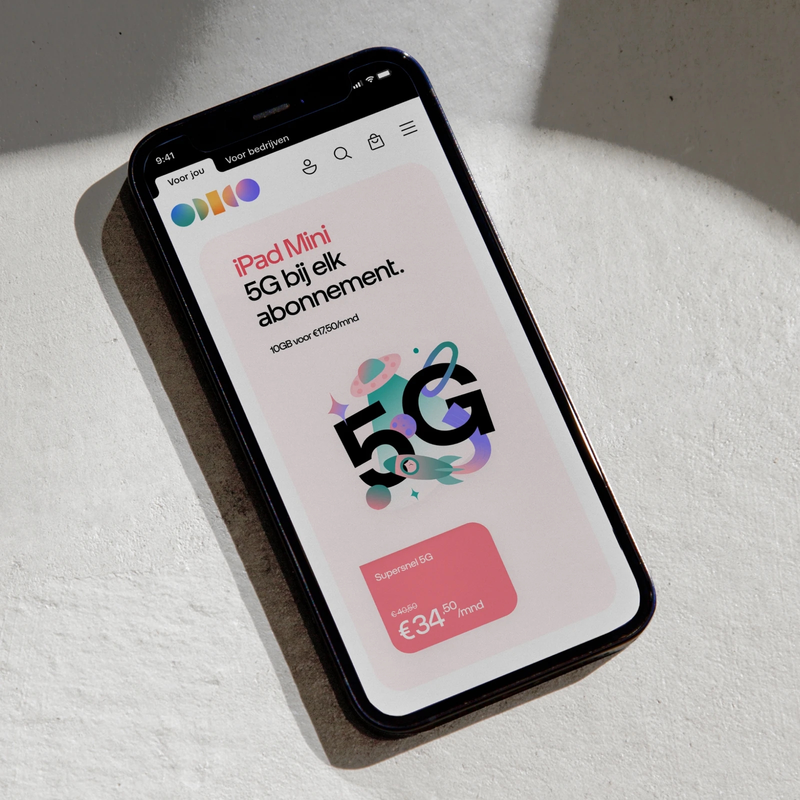
Application examples
Explore the following examples to see how our typography can be effectively utilised.