Layout
Our layout system, the Mirror, is adaptive and responds to all ratios. It echoes the symmetry of the logotype and sets different moods - from simple & clean, to dynamic - depending on the message that needs to be conveyed.


Grid and margins
Grids are a foundational element of the Odido brand identity, ensuring structure and proportion. Maintain equal margins on all sides in most cases. We offer two key grids: “Participation” for diverse designs and “Functional” primarily for editorial work.
Horizontal participation grid
On the Participation level, we use a poster grid to place the elements. The number of columns has to be a multiple of 4 and depends on the format ratio. This grid forms the guide for the placement of the mirror with both even & uneven panels. The minimum margins are 1/12 of the shortest side.

Vertical participation grid
For vertical layouts, apply the same rules as for the horizontal approach. The minimum margins are 1/12 of the shortest side.

Functional grid
On the Functional level, we use an editorial grid to place elements. There must be 12 columns. The minimum margins are 1/15 of the shortest side. The gutter is 1/3 of the margins. When the Functional grid follows a Participation grid, use consistent margins.

Don’ts
1. Do not use different size margins for all four sides.

2. Do not customise the margins.

Mirror construction
Mirror panels and axis
The Mirror is built with 2 to 3 panels following the grid. A minimum of 3 columns should be used for a panel. The meeting point of 2 panels is the axis for placement of the logo.

How to build the Glow Mirror
There are 4 Glows to create the Mirror with, each with its own unique qualities. To preserve the liveliness of the range of the Glow throughout the brand, be sure to use different ones throughout all the different touchpoints. Follow the steps and make sure the axis of the Mirror stays visible.

Mirror usage
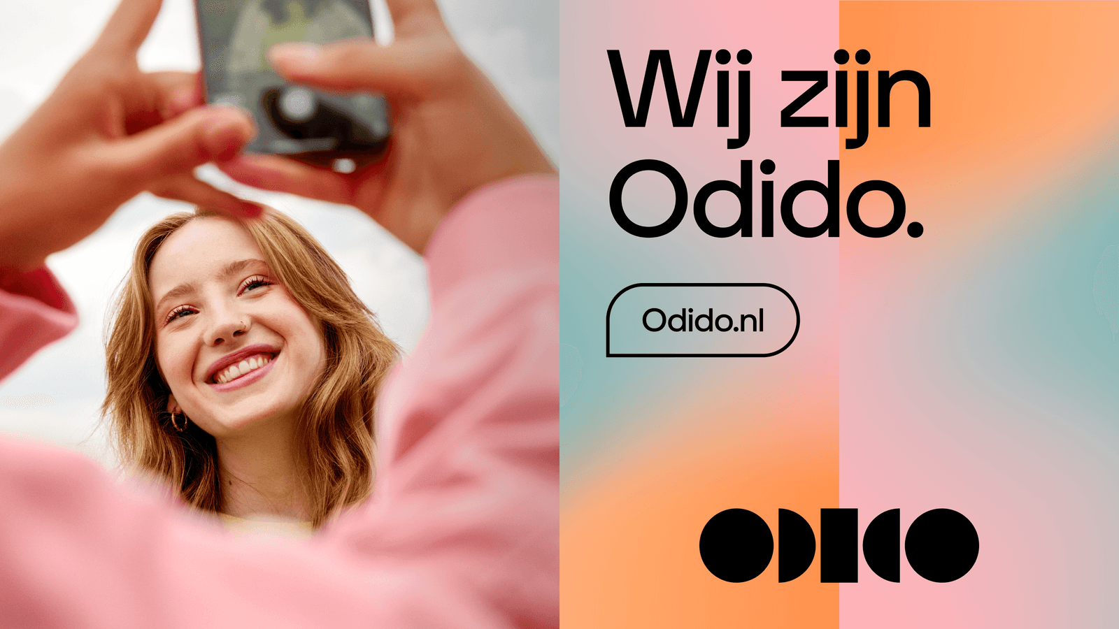
Glow mirror
Use this block to highlight parts of the image.


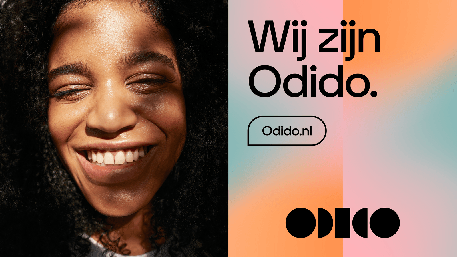
Glow and photography mirror
Use this block to highlight parts of the image.
White space and photography mirror
Use this block to highlight parts of the image.

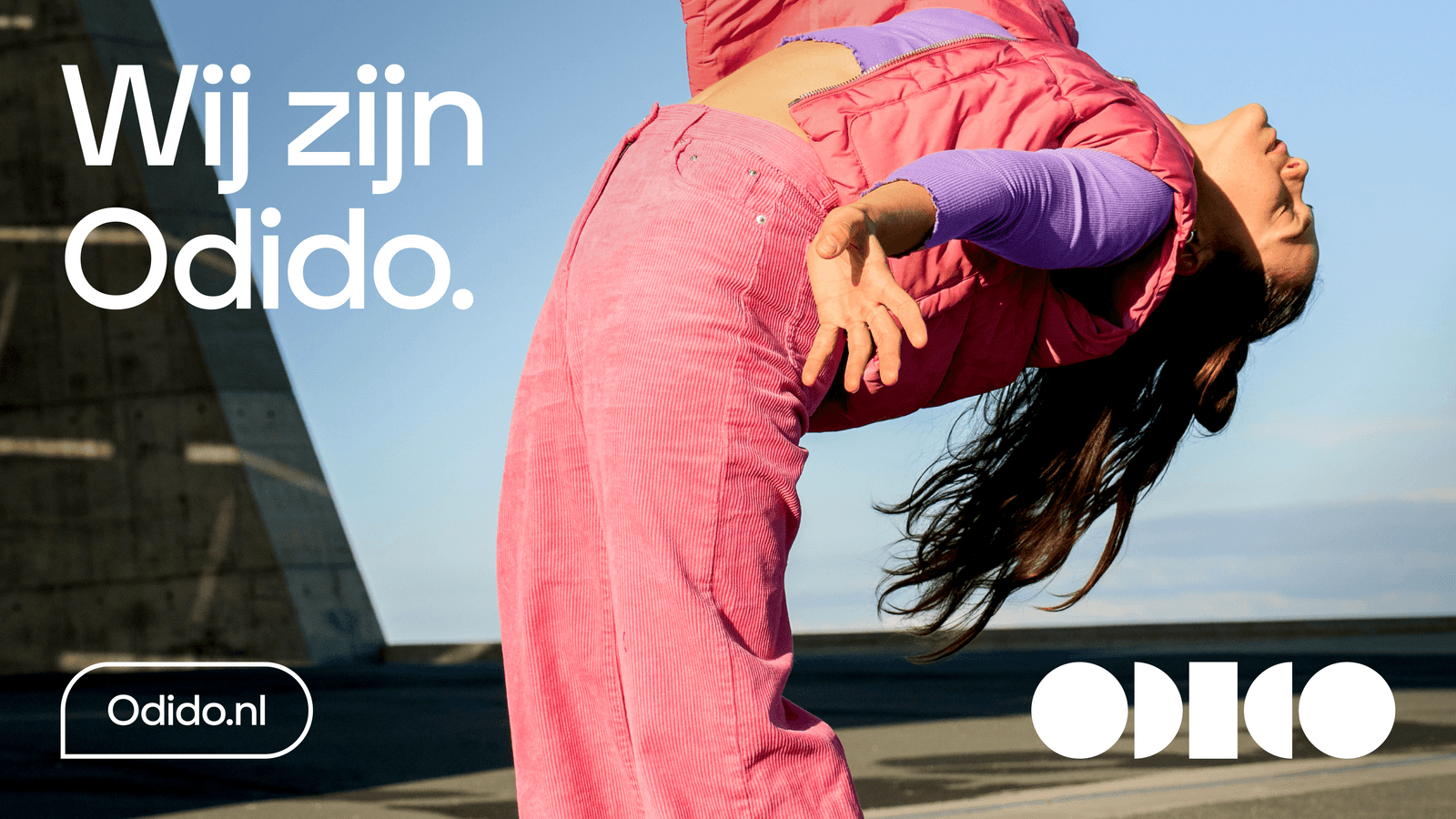
Full-bleed photography
Full bleed is preferred for thematic campaigns. Given that the contrast between photography and white or black typography/logo can be ensured.
Glow contrast
Our preferred option is black elements on Glow. When photography is dark, logo can go on the axis between 2 Glow panels. If the logo moves to the axis between the photography and the Glow panel then logo and elements switch to white, therefore the darker glow is used to create enough contrast.
Don’ts
Below are some examples that should always be avoided when using the Mirror.
1.Do not repeat the Glow without mirroring it.

2. Do not mix the orientation of the Glows in one design.

3. Do not mirror the Glows in a way that it creates one new glow.

4. Do not split panels into additional panels or mix multiples of them.

5. Do not mix light and dark Glows within the same layout.

6. Do not place a photo in between two Glows up to a 16:9 ratio.

7. Do not make the Glow a hero in favour of the photo.

8. Do not mix the panel directions.

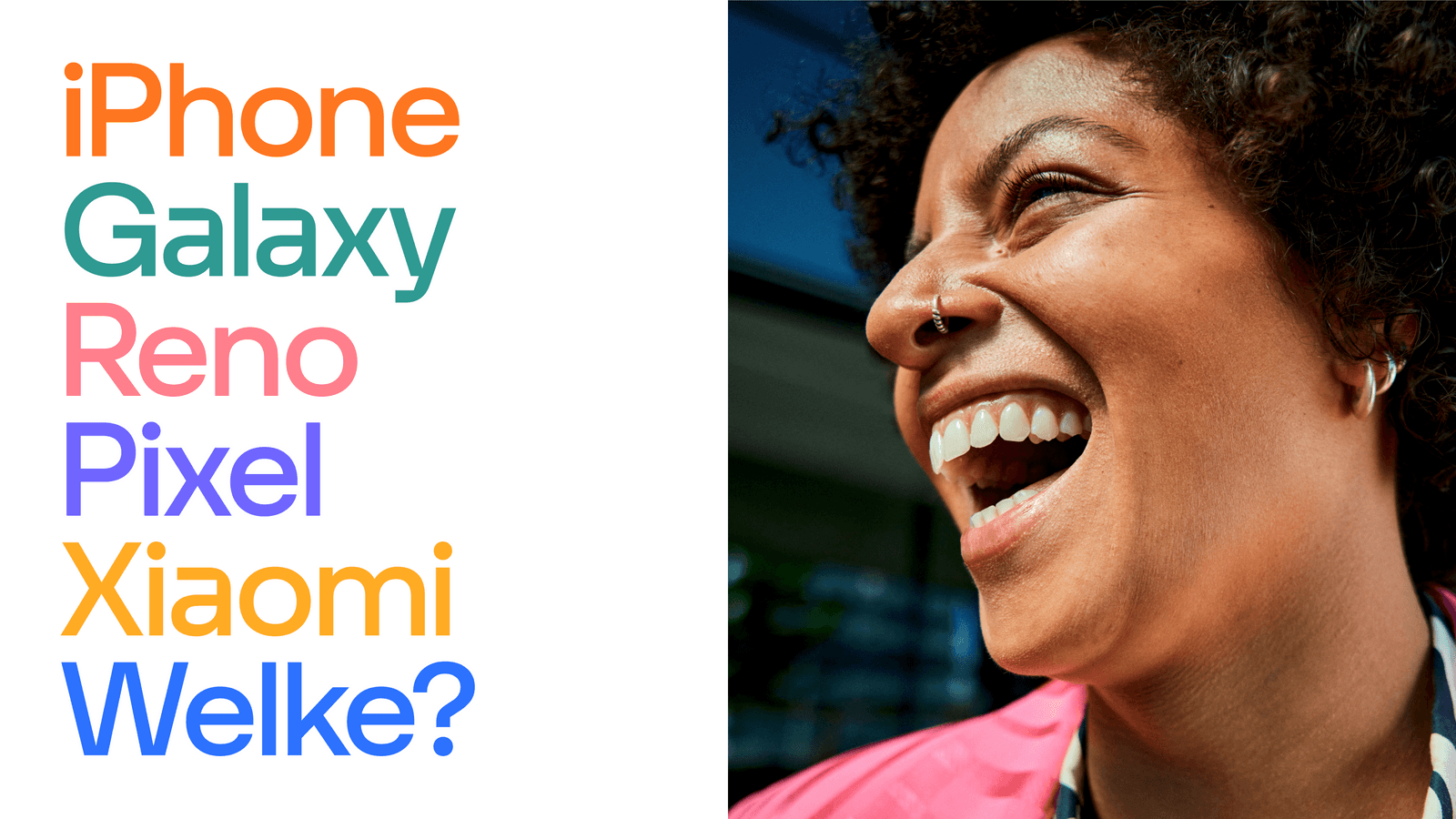
Typography placement
Typography is laid out with simplicity, avoiding complexity. Below are 3 choices for integrating typography into a composition.


Application examples
Explore the following examples to see how our layout can be effectively utilised.


