Photography
People give value to our technology. Whether it comes from the person next to them, a goal they achieve, or thinking of someone far away, we’ll show the freedom and possibilities our technology gives back: human connection.


Style
Human connection is represented with diverse and optimistic imagery. Always colourful, down-to-earth and human.


People focused
Like our brand, our photography puts people first. Real people, just like you and me. Inclusiveness is omnipresent, representing the diversity of our millions of customers.
Attributes
We’re looking for energy, positivity, character and a sparkle in the people we photograph. People are moving and connecting in the broadest sense of the word.

Lights
Both inside and outside, a bright day captures the right feeling. But it doesn’t always have to be sunny. Light and colour should help set the tone of positive vibes.

Colours
Colours are important to enhance an optimistic feeling and create a natural focus on the person. It’s important to create contrast between the colourful subject and background to avoid the subject getting lost in the image.

Composition
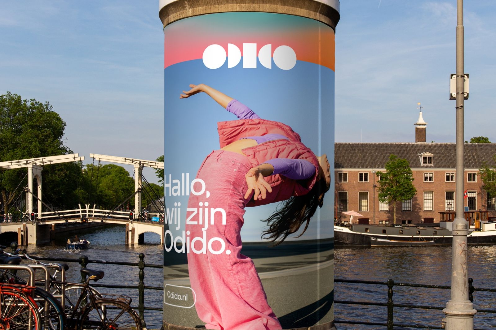
The subject is always people. The surroundings merely complement them. We’ll break through the calmness by bringing energy, authenticity and human movement into all of our images. We’ll use wide angles, shoot from above or below with the subject in action so that the viewer feels part of the scene.

Categories
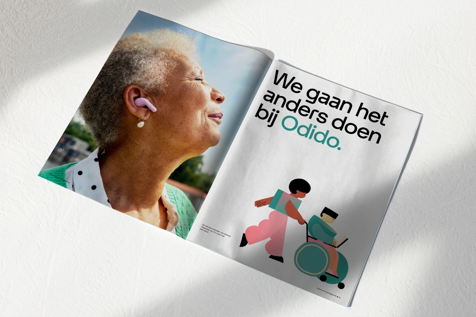
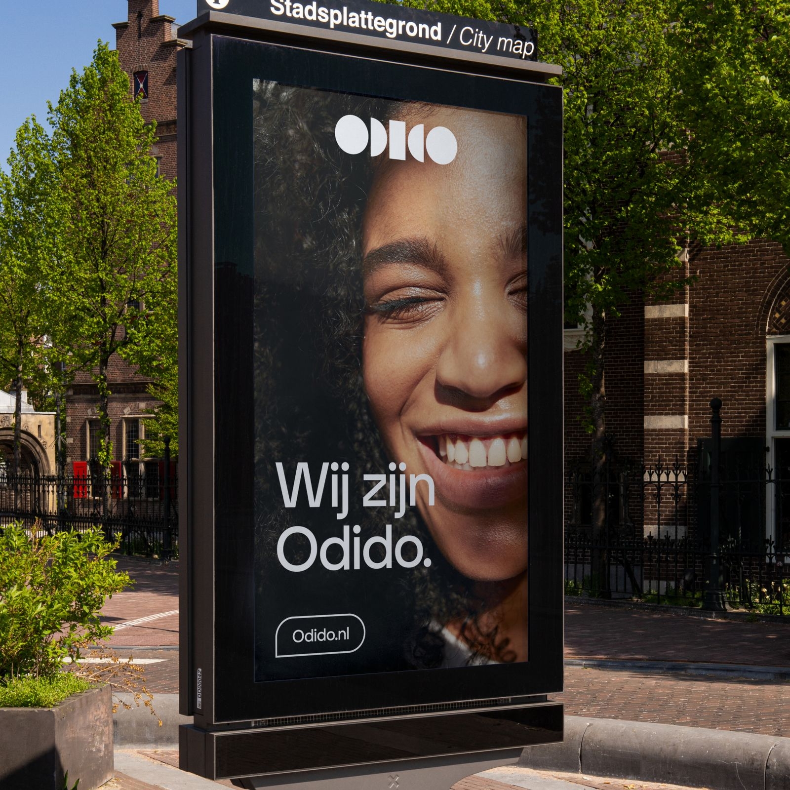
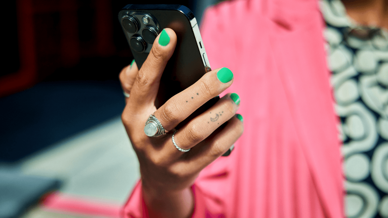
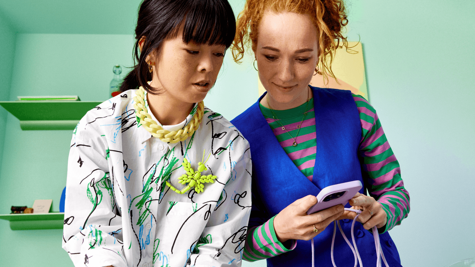
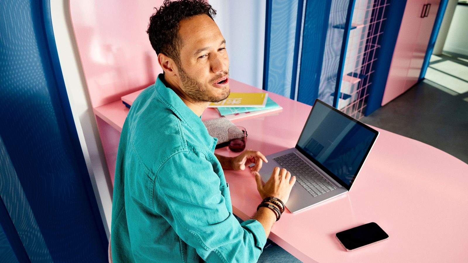
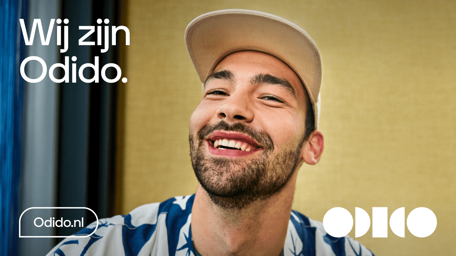
Our images are divided into 3 main categories: Context - people are shown in their environment. Portrait - we showcase people’s face & shoulders. The environment plays (almost) no role. Details - we show the devices in the presence of a human.

Applying photography
Categories combination
Try to balance the photography combinations to give variety to the canvas and highlight the importance of a straight-forward, positive and energetic attitude.
Glow combination
Select the best Glow combination by looking at the colour tones in the photography. In some cases, there are multiple options to choose from. The image library in the brand portal will show suggested combinations.
Photography usage examples
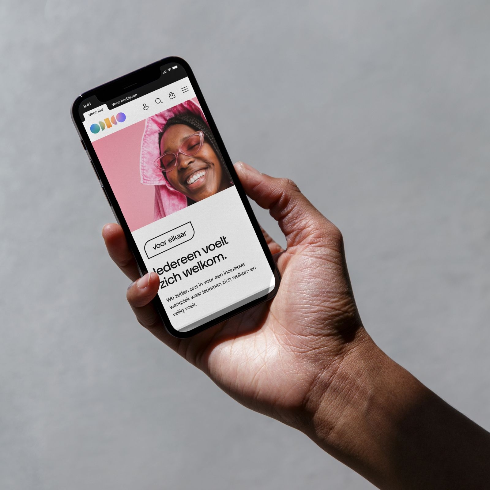
It’s always important to respect the subject. Below are some examples of how to use photography correctly within the layout system and in combination with our shapes family.
Don’ts
Below are some examples that should always be avoided when using our photography.
1. Do not add unnatural styling or effects.

2. Do not use full-length shots: they distance viewer from the scene.

3. Do not distort the images.

4. Do not focus the attention more on the wheelchair than the person.

5. Do not use devices without a human presence.

6. Do not show people smoking, drinking or distressing images.

7. Do not over zoom on the face.

8. Do not alter the lights and flatten them.

9. Do not place text on top of busy photographies.

10. Do not crop images covering the focal point.

Application examples
Explore the following examples to see how our core palette can be effectively utilised.