Colour
Odido’s core palette is guided by the Glow, celebrating the energy of human connections. For Odido, connections are like a spectrum of colours, merging to create an ever-changing impression.


Colour palettes
Core colour palette
Our core colour palette embodies the essence of our identity, it is centered around our four Glows and complemented by black and white.
Secondary colour palette
Our secondary palette contains six hues and tints, the same that form the Glows. Roll over them to see their values and copy their hex code.
Colour combinations
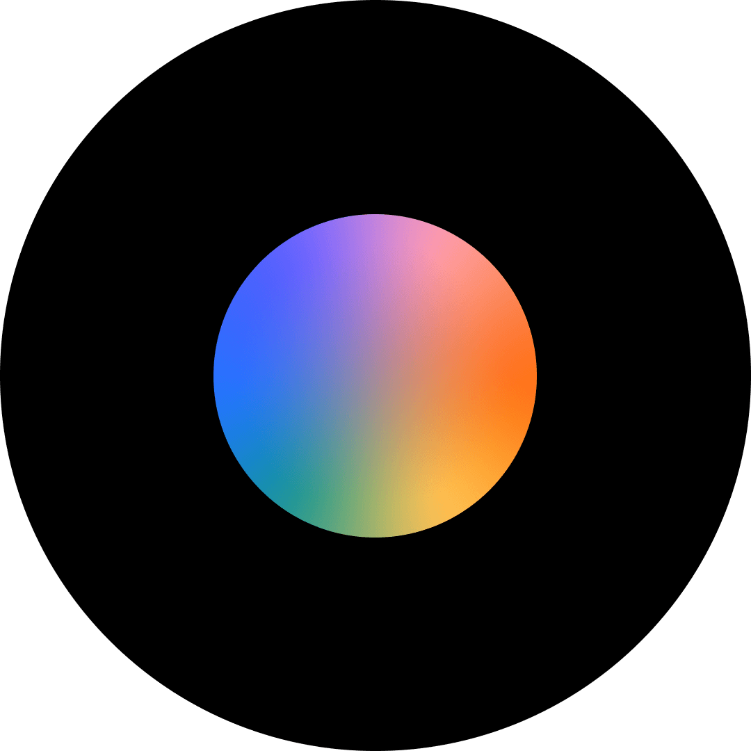
Glows colour combination
By creating gradients with complementary colours, we show strong connections with distinctive tones. A neighbouring colour is added to harmonise the result.

Examples
Use the examples below to master the art of matching elements to the Glows.
Step one

Step two
.svg)
Step three

Step four

The Glow contrast
Use darker versions of Glow sparingly to ensure readability.
Default Glow

Darker Glow

Secondary colour palette combination
Leverage this box to discover ways of enhancing the visibility of copy and elements on various backgrounds using our secondary palette.
Black background

White background

10% tint background

20% tint background

40% tint background

100% tint background

Applying colours
Colour proportions across levels
Below you can see how to use colours on different levels. Entry level is mostly colour logo on black background. Participation level is black or white logo (and other elements) on glow background. Functional level uses more white space and solid colours (hues and tints).
1. Entry level
2. Participation level

3. Functional level

Colour usage examples across levels
Below are examples of how to use the colours on our brand levels in chronological order: entry, participation and functional.


Don’ts
Below are some examples that should always be avoided when using our colour palette.
1. Do not use too little contrast with the background.

2. Do not use gradients in typography.

3. Do not use different colour combinations than the existing Glows.

4. Do not mix two different solids together.

5. Do not use colours that don’t belong to our core palette.

6. Do not use two different Glows close to each other.

7. Do not put text or logos on low-contrast images.

8. Do not place colour logo on top of the Glow.

9. Do not mask the Glows with the logo.

10. Do not mix a black logo with white text and vice versa.

Application examples
Explore the following examples to see how our core palette can be effectively utilised.


